It all started when I wanted to buy a new Mac. I went into a store, checked a few models and decided on the new Macbook Pro. I got an attractive offer and yet I still wanted to check the price at the official store, where I saw the exact same model but at a 15% increase in price.
Eventually, even though the price was higher – I pulled out my credit card and made the purchase at the second store.
Sounds irrational? Absolutely!
Well, not exactly.

We all love to buy low cost but somehow we always end up paying a little more in return for peace of mind. We want to know that we made the right decision, we bought at the right place, from the right person and that we got full value for our money.
In other words, we want a sense of confidence. We want to believe the salesman and feel secure with the business and product.
As a marketer you should always keep in mind that trust is one of the most important parameters that affect the customer’s decision to purchase and in many cases can influence customers to pay more.
In fact, It doesn’t matter how low or tempting your price is – if you don’t give your potential customer the feeling that you are reliable and that buying from you is safe, they will not hesitate to buy from the competitor even if it will cost them more. So, if you would like to optimize your conversion rate and have already tried various sales or cut off prices and nothing seems to quite work – it’s probably time to move on to something new.
How to Easily Create Trust and Build Confidence in Your Website
This post will talk about how to increase the trust of your website users. We will focus on the content that needs to be displayed, but no less important on the way it should be presented.
We will try to understand how to write and how to combine elements that will achieve the goal and will encourage the user to continue to the next step and perform the desired action – Conversion!
In order to gain trust, one needs to keep in mind the 2 major aspects – the textual and the visual.
Increasing Trust With the Right Words
The words you use have a lot of impact on customers. They present you and your products, they differentiate you from competition, and they create interest around you. Therefore, when used properly, they have a number of functions:
-
Grab the user’s attention
-
Tempt and convince that this is a worthwhile proposal
-
Inspire confidence in you and in your offer
Needless to say that without the third stage – your efforts will be in vain and the visitor will move on to your competitor.
So what words should be used?
It’s a good question and the answer is very simple – use the words that your audience uses.
It requires you to do some research and get to know your users well, their needs, their desires and their dreams.
If a visitor comes to the website, reads the content on it and still feels confused – you probably didn’t understand his Jargon well enough, your offer may have been a bit too vague or the benefits of the offer isn’t clear and prominent.
If you are not using the right words, your visitor will read your offer but will quickly come to the conclusion that your product isn’t going to solve his problem.
Therefore, be sure to speak at his eye level, make sure to use wording that your visitor is familiar with and most importantly – show him that you think the same way, that you understand him and the problem he is facing, and that you are able to solve it and make it easier for him.
These are the things that will make him open up to you, want to listen to you, and this is also how you’ll gain his trust.

Optimization tips and highlights using words that build trust:
- Research the internet to find out how users describe the problem that you’re solving. Quora is a good place to start.
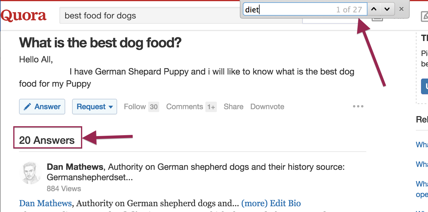
For example, if I sell dog food, I will go to Quora and check which terms people use the most in order to describe the ideal dog food for them.
In this case, I see that the word “diet” is mentioned 27 times out of 20 comments, and, therefore I will change my title from “The Tastiest Food For Your Dog” to a slightly different title: “XYZ (brand) – Diet Food For Healthier Dogs”:
- Writing everywhere that you are the best and that your products are of top notch quality – won’t quite do the job. Focus on “why”, give reasons, elaborate and explain. Find your unique value – that’s what will make the visitor realize that you really are the best for him:

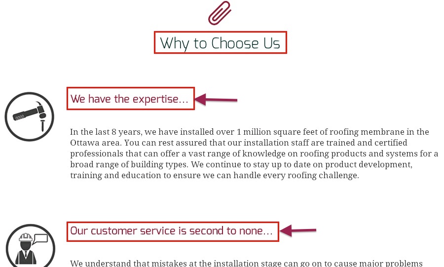
- Instead of writing that you are the best, focus on the benefits of the product and not its features. Put the focus on the customer, i.e., what benefits will the customer get from using the product and not what the product does:
-
In other words – this TV does not have “4K SUHD and a curved panel”, but rather this TV will “dispel any moment of boredom and give abundance and diversity so that with a click of a button you can choose your favorite programs”.
(There’s no need to panic from long titles. They work).
-
Do not overdo it and beautify reality. It is important to be transparent and provide accurate details.
-
Ask yourself if you are trustworthy? does it seem too good to be true? and if so – are you committed and able to deliver all you have promised? Would you believe yourself (if you were on the customer side, of course …)?
-
Try to anticipate what questions might cause hesitation at the prospect, and then answer them to eliminate resistance in advance.
For example: How much does the shipping cost, how long does it take to arrive, whom to turn to if there’s a problem, what is the return/refund policy, is there warranty, is the website secure and so on.
Most of these questions revolve around trust. The more you prove transparency and provide more information – the more the user will feel confident to buy from you.
-
Most importantly – do not try to hard-sell. Offer a real value to the user. Create an image of experts and thought leaders in your field and avoid sounding too much like a pushy salesperson.
How to Boost Sense of Trust Using Visuals
In the previous part we learned how to build trust using words, and now we will learn how to do this using visual elements.
It is likely that before people read what you have to offer, they will examine and judge you according to your website visibility.
That’s how it is. First, they look at the vase and only then at what’s in it.
If you think about it for a moment, it is not something unusual. After all, this is how we behave in reality. We are drawn to beauty, order and cleanliness. These are things that leave a positive impression on us and contribute to our sense of trust.
A messy and sluttish shop will not give us the desire to buy in it, it will create fears and doubts that will turn us away and send us looking elsewhere. Therefore, it is very important to keep a friendly and pleasant website display.
Make sure to keep a spacious layout of the elements, a solid line both in design and content, use appropriate colors and use images you took and not ones that were downloaded from a free stock photos website.
To the bravest among you, I recommend using a real face image (yours or your employees’), so that your visitors can “really” get to know you and feel closer to you. The effect on the sense of trust is tremendous.
Look at the screenshots from BlueHost – one of the world’s largest storage servers today that handle more than 2 million websites. Which of the pages would you trust more?
If you chose the second option – you are not the only one. The lady there looks more real and convincing and the design looks cleaner and modern.
In the second design there’s less text and less emphasis of “UNLIMITED” stuff, however that is actually what make us trust it more. Bluehost also uses the color blue as their main color which is known for the psychological effect of trust and stress free.
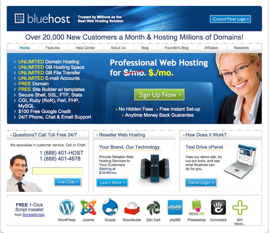
BlueHost – Before
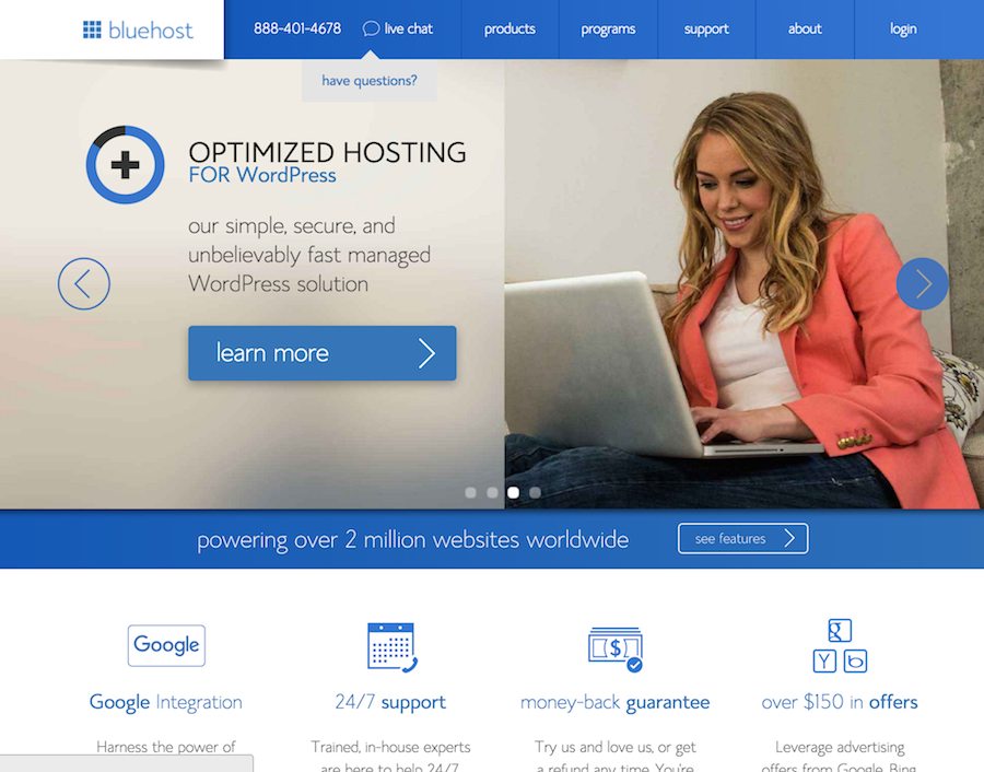
BlueHost – After
More on optimizing trust using visual means:
Testimonials -
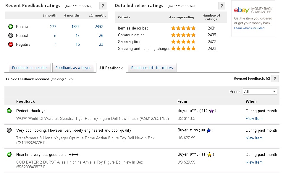
Almost every quarter there is a new research about the growing importance of users testimonials. Even if the customer don’t really know those recommending – they will perceive them as the recommendation of a close friend or even an acquaintance and will be affected by them in the process of acquisition.
Since users testimonials are so important, you should consider adding a platform on your website for leaving comments and opinions about products, so that anyone who wants to give his opinion on the purchasing process, the quality of the product and other aspects that relate to the purchasing process will be able to do so.
When your potential customers read reviews from people who have already purchased from you in the past (assuming that their experience was positive) – the purchasing process will seem to them much more natural and safe. It is easier for us to take action if we know someone has already done it before and was happy with it.
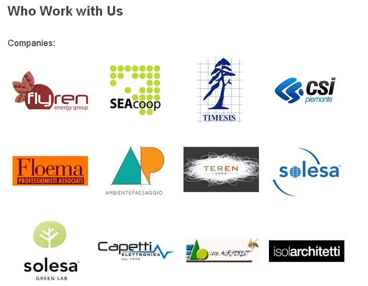
Logos of leading customers - When customers see that the largest and most successful companies in the market have chosen to invest their money in your product – it makes them feel more relaxed and increases their sense of security.
The customer will think to himself, “Wait, these are big companies must have double checked and know what’s best for them. If it’s good for them – why shouldn’t it be good for me?”
This is exactly the feeling we want them to feel.
When you present these companies on your website – it will tell a lot about you, it will push your position and make the potential customer feel that buying from you is the right decision. After all, a big and reliable company has already done it before, and if a big company did it then why shouldn’t the customer?
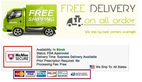
Secured purchase signs - Securing credit cards is perhaps the biggest concern of buyers today. If you want to be provided with sensitive details, such as personal information or credit card details, you would have to remove any concern about possible security bursts.
Make it clear to the users that their privacy is important to you and you do everything needed in order to protect it. Ensure that their data is well protected and you will not pass it to a third party. In addition, a relevant symbol of security will significantly enhance the sense of security, but be careful and do not overload in such!
Absurdly – excessive “reliable elements” can actually create the opposite effect and lead to suspicion.
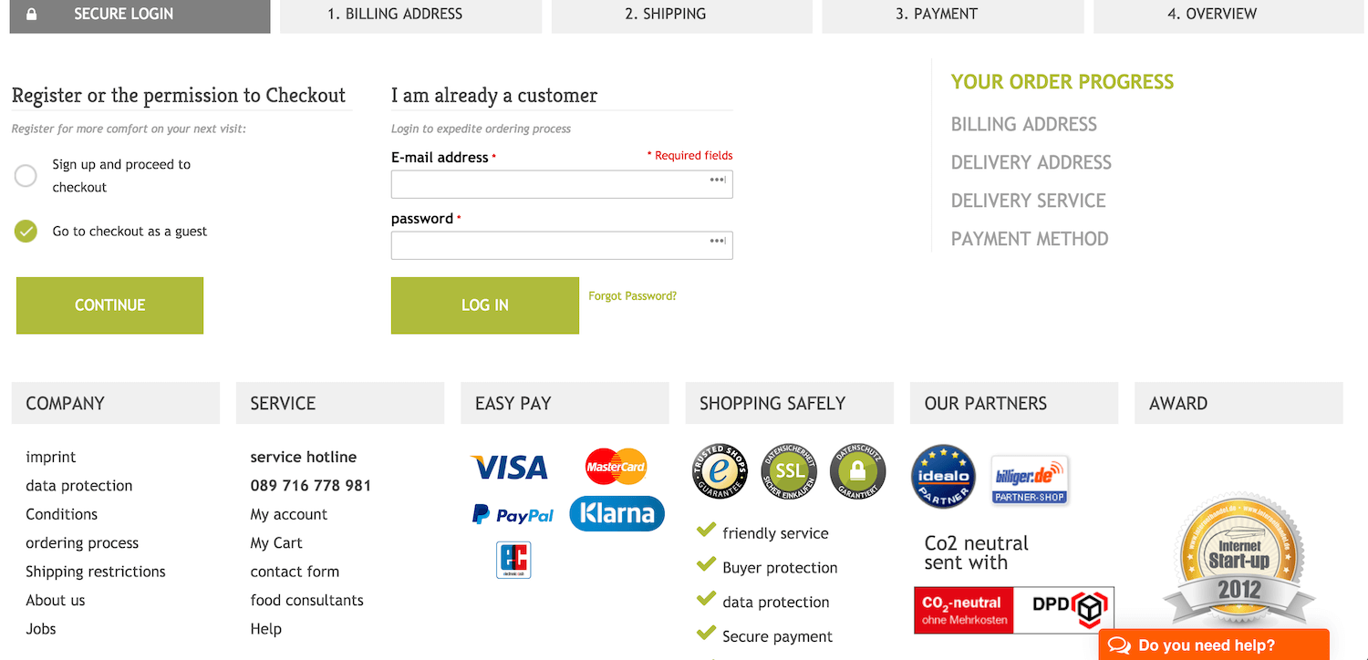
An additional example can be found in the next screenshot that complies with all the rules perfectly – usually the biggest abandonment on e-commerce websites, occurs at the registration stage and afterward when filling the credit card details.
This website successfully transmits high confidence, especially in the first stage, using a clean design, highlighting the ease of buying (using Paypal / credit), the highest security, the business partners and eventually the awards the website has won.
There is no doubt that it makes the user feel he’s in good hands and will fill in his details, even if later on he would abandon the process, they will have his email address so they could send him reminders to return and complete the purchase.
FAQ page – we actually touched it a little earlier. We spoke about the importance of answering the user’s any possible question in advance in order to avoid hesitation.
Once you have consolidated a list of questions, provide them a solution and devote a special page on the site which will be easy to access, prominent and clear.
Here is a great post from Jason Shah that explains how to create a great FAQ pages that converts.
Contact Us - If you’ve done all this and feel your user still has doubts or something is not quite clear to him – show him that he always has someone and somewhere to turn to.
It is very important to place the contact buttons in prominent areas on the site and particularly on the payment pages, in order to remove as many obstacles as possible on the way to the purchase. You can provide a phone number or e-mail address, but the priority is to operate an online chat such as Zopim, LivePerson or Olark where you’ll always have a representative at any time for any question.
The sooner you answer – the more the customer will remain “hot”, therefore it is important to have a fast response. Additionally, the possibility of instantaneous communication proves you really are there and that you are reliable, which provides you a few more trust points.

Summary
As you have noticed, building a reliable landing page requires a lot of thought and effort, but eventually it pays off big time.
You need to know your audience better, speak their language, create value and show it to them, as well as design and incorporate elements that make the visitor feel that you are the best choice for him. Once you do that, you will see how your conversions begin to soar.
There’s no doubt – trust is what converts visitors to customers, and this is the difference between a successful business to a business which is struggling for each transaction in order to survive.
And we are sure which side you want to be on…
Do you have any more tips that can improve the user’s trust on a website? Share them with us in the comments below.
How to Leverage Trust to Increase Landing Page Conversions 4.50/5 (90.00%) 8 votes
Related Posts


How to Leverage Trust to Increase Landing Page Conversions
It all started when I wanted to buy a new Mac. I went into a store, checked a few models and decided on the new Macbook Pro. I got an attractive offer and yet I still wanted to check the price at the official store, where I saw the exact same model but at a 15% increase in price.
Eventually, even though the price was higher – I pulled out my credit card and made the purchase at the second store.
Sounds irrational? Absolutely!
Well, not exactly.
We all love to buy low cost but somehow we always end up paying a little more in return for peace of mind. We want to know that we made the right decision, we bought at the right place, from the right person and that we got full value for our money.
In other words, we want a sense of confidence. We want to believe the salesman and feel secure with the business and product.
As a marketer you should always keep in mind that trust is one of the most important parameters that affect the customer’s decision to purchase and in many cases can influence customers to pay more.
In fact, It doesn’t matter how low or tempting your price is – if you don’t give your potential customer the feeling that you are reliable and that buying from you is safe, they will not hesitate to buy from the competitor even if it will cost them more. So, if you would like to optimize your conversion rate and have already tried various sales or cut off prices and nothing seems to quite work – it’s probably time to move on to something new.
How to Easily Create Trust and Build Confidence in Your Website
This post will talk about how to increase the trust of your website users. We will focus on the content that needs to be displayed, but no less important on the way it should be presented.
We will try to understand how to write and how to combine elements that will achieve the goal and will encourage the user to continue to the next step and perform the desired action – Conversion!
In order to gain trust, one needs to keep in mind the 2 major aspects – the textual and the visual.
Increasing Trust With the Right Words
The words you use have a lot of impact on customers. They present you and your products, they differentiate you from competition, and they create interest around you. Therefore, when used properly, they have a number of functions:
Grab the user’s attention
Tempt and convince that this is a worthwhile proposal
Inspire confidence in you and in your offer
Needless to say that without the third stage – your efforts will be in vain and the visitor will move on to your competitor.
So what words should be used?
It’s a good question and the answer is very simple – use the words that your audience uses.
It requires you to do some research and get to know your users well, their needs, their desires and their dreams.
If a visitor comes to the website, reads the content on it and still feels confused – you probably didn’t understand his Jargon well enough, your offer may have been a bit too vague or the benefits of the offer isn’t clear and prominent.
If you are not using the right words, your visitor will read your offer but will quickly come to the conclusion that your product isn’t going to solve his problem.
Therefore, be sure to speak at his eye level, make sure to use wording that your visitor is familiar with and most importantly – show him that you think the same way, that you understand him and the problem he is facing, and that you are able to solve it and make it easier for him.
These are the things that will make him open up to you, want to listen to you, and this is also how you’ll gain his trust.
Optimization tips and highlights using words that build trust:
For example, if I sell dog food, I will go to Quora and check which terms people use the most in order to describe the ideal dog food for them.
In this case, I see that the word “diet” is mentioned 27 times out of 20 comments, and, therefore I will change my title from “The Tastiest Food For Your Dog” to a slightly different title: “XYZ (brand) – Diet Food For Healthier Dogs”:
In other words – this TV does not have “4K SUHD and a curved panel”, but rather this TV will “dispel any moment of boredom and give abundance and diversity so that with a click of a button you can choose your favorite programs”.
(There’s no need to panic from long titles. They work).
Do not overdo it and beautify reality. It is important to be transparent and provide accurate details.
Ask yourself if you are trustworthy? does it seem too good to be true? and if so – are you committed and able to deliver all you have promised? Would you believe yourself (if you were on the customer side, of course …)?
Try to anticipate what questions might cause hesitation at the prospect, and then answer them to eliminate resistance in advance.
For example: How much does the shipping cost, how long does it take to arrive, whom to turn to if there’s a problem, what is the return/refund policy, is there warranty, is the website secure and so on.
Most of these questions revolve around trust. The more you prove transparency and provide more information – the more the user will feel confident to buy from you.
Most importantly – do not try to hard-sell. Offer a real value to the user. Create an image of experts and thought leaders in your field and avoid sounding too much like a pushy salesperson.
How to Boost Sense of Trust Using Visuals
In the previous part we learned how to build trust using words, and now we will learn how to do this using visual elements.
It is likely that before people read what you have to offer, they will examine and judge you according to your website visibility.
That’s how it is. First, they look at the vase and only then at what’s in it.
If you think about it for a moment, it is not something unusual. After all, this is how we behave in reality. We are drawn to beauty, order and cleanliness. These are things that leave a positive impression on us and contribute to our sense of trust.
A messy and sluttish shop will not give us the desire to buy in it, it will create fears and doubts that will turn us away and send us looking elsewhere. Therefore, it is very important to keep a friendly and pleasant website display.
Make sure to keep a spacious layout of the elements, a solid line both in design and content, use appropriate colors and use images you took and not ones that were downloaded from a free stock photos website.
To the bravest among you, I recommend using a real face image (yours or your employees’), so that your visitors can “really” get to know you and feel closer to you. The effect on the sense of trust is tremendous.
Look at the screenshots from BlueHost – one of the world’s largest storage servers today that handle more than 2 million websites. Which of the pages would you trust more?
If you chose the second option – you are not the only one. The lady there looks more real and convincing and the design looks cleaner and modern.
In the second design there’s less text and less emphasis of “UNLIMITED” stuff, however that is actually what make us trust it more. Bluehost also uses the color blue as their main color which is known for the psychological effect of trust and stress free.
BlueHost – Before
BlueHost – After
More on optimizing trust using visual means:
Testimonials -
Almost every quarter there is a new research about the growing importance of users testimonials. Even if the customer don’t really know those recommending – they will perceive them as the recommendation of a close friend or even an acquaintance and will be affected by them in the process of acquisition.
Since users testimonials are so important, you should consider adding a platform on your website for leaving comments and opinions about products, so that anyone who wants to give his opinion on the purchasing process, the quality of the product and other aspects that relate to the purchasing process will be able to do so.
When your potential customers read reviews from people who have already purchased from you in the past (assuming that their experience was positive) – the purchasing process will seem to them much more natural and safe. It is easier for us to take action if we know someone has already done it before and was happy with it.
Logos of leading customers - When customers see that the largest and most successful companies in the market have chosen to invest their money in your product – it makes them feel more relaxed and increases their sense of security.
The customer will think to himself, “Wait, these are big companies must have double checked and know what’s best for them. If it’s good for them – why shouldn’t it be good for me?”
This is exactly the feeling we want them to feel.
When you present these companies on your website – it will tell a lot about you, it will push your position and make the potential customer feel that buying from you is the right decision. After all, a big and reliable company has already done it before, and if a big company did it then why shouldn’t the customer?
Secured purchase signs - Securing credit cards is perhaps the biggest concern of buyers today. If you want to be provided with sensitive details, such as personal information or credit card details, you would have to remove any concern about possible security bursts.
Make it clear to the users that their privacy is important to you and you do everything needed in order to protect it. Ensure that their data is well protected and you will not pass it to a third party. In addition, a relevant symbol of security will significantly enhance the sense of security, but be careful and do not overload in such!
Absurdly – excessive “reliable elements” can actually create the opposite effect and lead to suspicion.
An additional example can be found in the next screenshot that complies with all the rules perfectly – usually the biggest abandonment on e-commerce websites, occurs at the registration stage and afterward when filling the credit card details.
This website successfully transmits high confidence, especially in the first stage, using a clean design, highlighting the ease of buying (using Paypal / credit), the highest security, the business partners and eventually the awards the website has won.
There is no doubt that it makes the user feel he’s in good hands and will fill in his details, even if later on he would abandon the process, they will have his email address so they could send him reminders to return and complete the purchase.
FAQ page – we actually touched it a little earlier. We spoke about the importance of answering the user’s any possible question in advance in order to avoid hesitation.
Once you have consolidated a list of questions, provide them a solution and devote a special page on the site which will be easy to access, prominent and clear.
Here is a great post from Jason Shah that explains how to create a great FAQ pages that converts.
Contact Us - If you’ve done all this and feel your user still has doubts or something is not quite clear to him – show him that he always has someone and somewhere to turn to.
It is very important to place the contact buttons in prominent areas on the site and particularly on the payment pages, in order to remove as many obstacles as possible on the way to the purchase. You can provide a phone number or e-mail address, but the priority is to operate an online chat such as Zopim, LivePerson or Olark where you’ll always have a representative at any time for any question.
The sooner you answer – the more the customer will remain “hot”, therefore it is important to have a fast response. Additionally, the possibility of instantaneous communication proves you really are there and that you are reliable, which provides you a few more trust points.
Summary
As you have noticed, building a reliable landing page requires a lot of thought and effort, but eventually it pays off big time.
You need to know your audience better, speak their language, create value and show it to them, as well as design and incorporate elements that make the visitor feel that you are the best choice for him. Once you do that, you will see how your conversions begin to soar.
There’s no doubt – trust is what converts visitors to customers, and this is the difference between a successful business to a business which is struggling for each transaction in order to survive.
And we are sure which side you want to be on…
Do you have any more tips that can improve the user’s trust on a website? Share them with us in the comments below.
Related Posts
Tags: