Most of the time when we think about optimizing our branding method, we tend to be focused on our SEO keywords, content, headlines, images, colors and CTA buttons.
All of these are highly important, but in this post I want to reveal the importance of micro-copy on conversions, and how using it correctly can increase your conversions dramatically.
So, what is micro-copy?
Micro-copy is all the small, tiny words and sentences that on first sight seem meaningless for our visitors.
For example: contact form explainers, the text that is written right after the product description, 404 error pages, checkout pages and many more.
We tend not to think of these words as “a real content” or as a place to promote our brand, but the truth is that all of these words are unused opportunities to interact with our visitors.
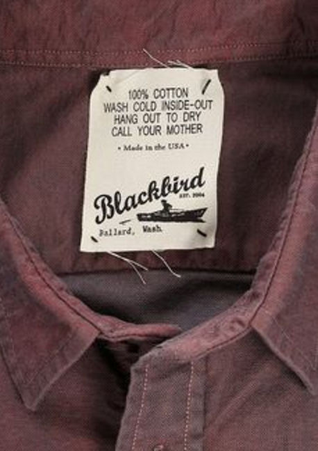
Read closely this shirt laundry instructions and tell me what did you miss on first glance? 
Just in case you’ve missed it… it’s written:
100% Cotton
Wash cold inside out
Hang out to dry
Call your mother
Why Micro Copy is so important to increase conversions?
Micro-copy gives you a special opportunity to reach out to your visitors, speaking in their language.
It can make visiting your website to a cool and fun experience, It will allow you to pop-out while everyone is doing more of the same dull and informative way of writing.
Micro-copy is targeted, short, lays within context – and it’s (almost) the best place you should use that will help you increase your conversions.
Some examples:
This is micro-copy:

Facebook is all about creating a space of your own, a place where you can share your thoughts. So in order to encourage people to interact and to share their minds, Facebook simply added “What’s on your mind?” and not the “Write here…” we usually see in text fields.
So is this:
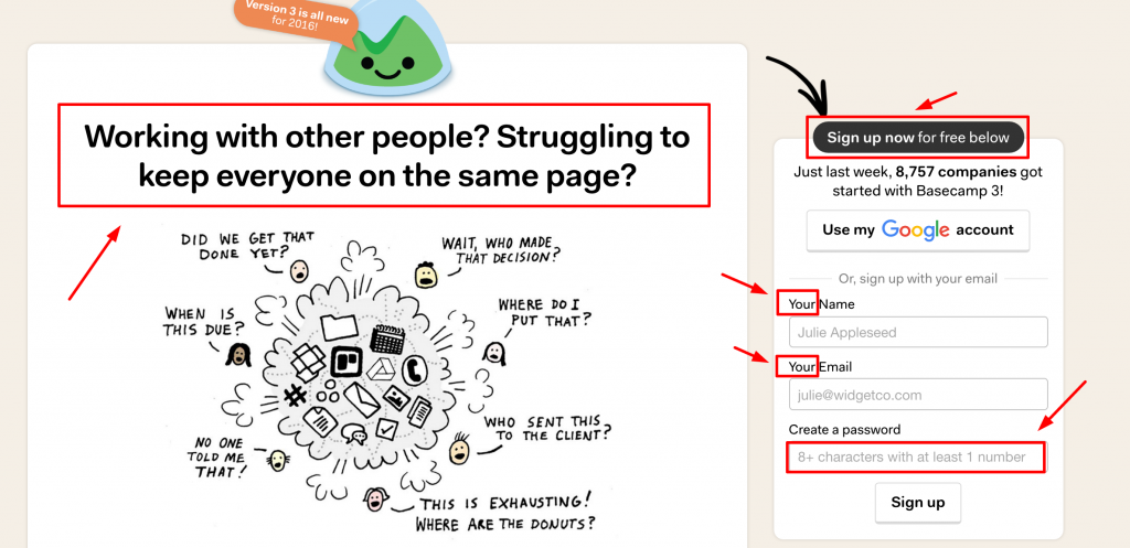
This is a great example of taking all those tiny words and phrases that interact with your visitors and turn them into a great micro-copy, maximizing your website’s potential to it’s fullest. The headline is approachable and is written in a way people can feel sympathy. This text understands their needs!
Take a look again at the top of the form in the example. It informs us that signing up will be free. That helps solve in advance any uncertainty regarding pricing that may occur.
In the form, there’s the use of the words “your” and “my” which creates the feeling that this thing – is yours. It’s about you. Not others, and not the brand.
The last step of creating a password explains what to do in an easy, friendly way.
Here’s another example:
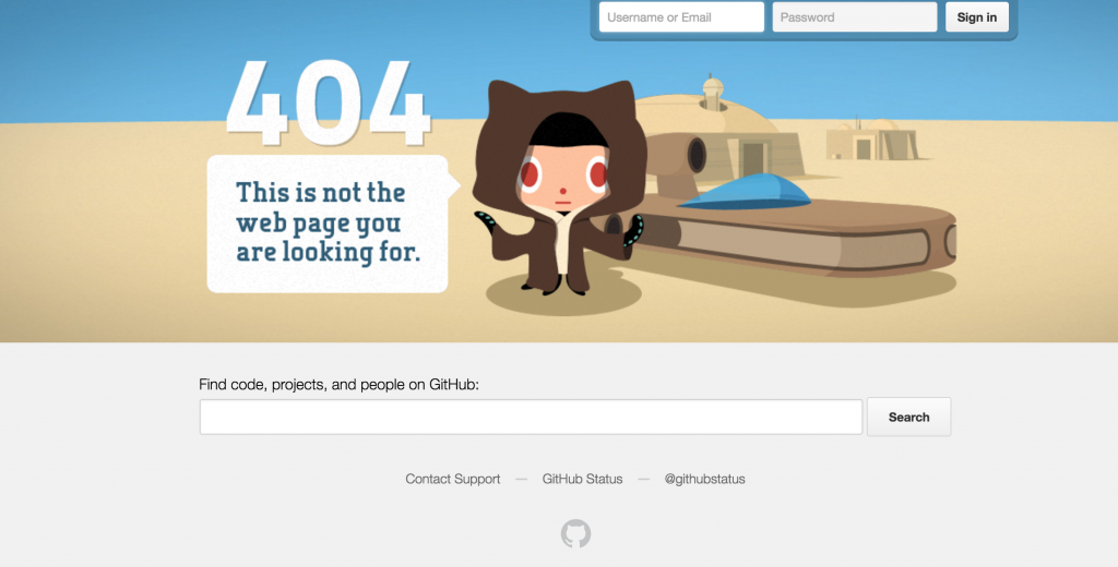
Classic Episode IV reference. In this 404 Error page, we have the nice illustration that let the visitors know the page does not exist anymore, then underneath it comes the micro-copy telling the visitor what he can search and find in Github.com.
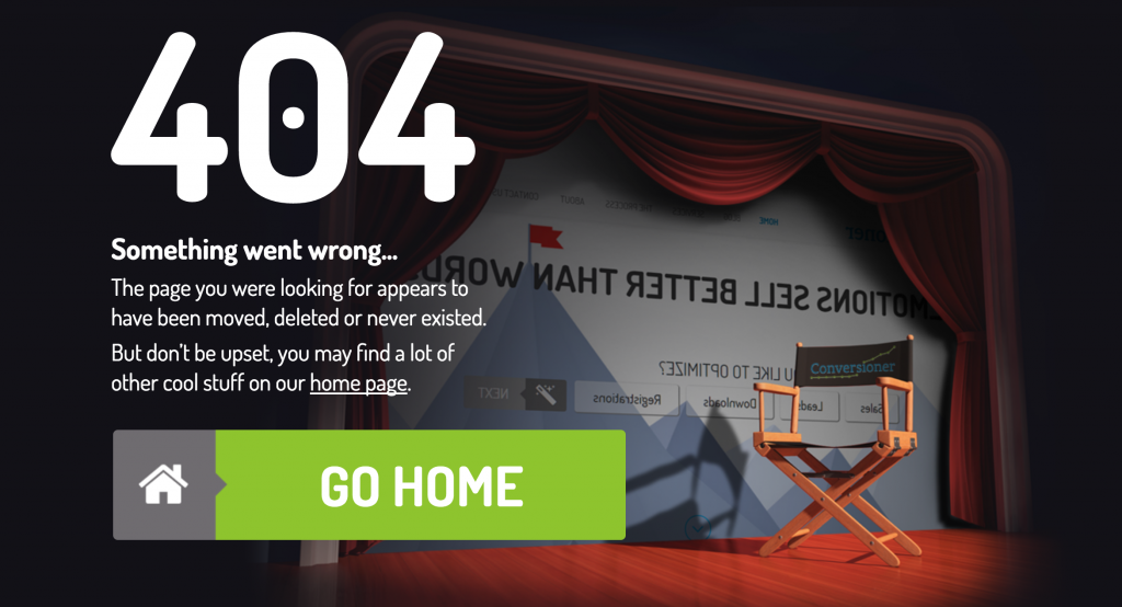
Look at the micro-copy in Conversioner’s 404 page. Usually when people get to 404 pages they’re frustrated, but this page tells them to “not be upset” and recommends them to find “cool stuff” in the home page:
So now you understand what micro-copy is. What’s next?
My first advice: Use it.
Open your website and ask yourself: am I using a human’s or computer’s language? does the language I use contributes to the user experience? Is it unique? Is it inspiring or creates excitement or boring like all of my competitors? Is it written the way my visitors think?
I want you to linger a bit on the idea of your visitors way of thinking.
A Lot of time we tend to think that our website’s language is reachable and appropriate to the message we want to deliver. But I bet that if you really think about it – maybe you can make it better. So first, think as if YOU ARE the visitor.
Many times we are way too concern in our SEO campaigns and sticking to the SEO methods, writing blog posts in order to get more ranking and drive more traffic to our website.
So let me tell you something important about it – it’s ok, it’s important, but it’s not everything.
When you really think of it, maybe it’s not what your visitors expect or want from your website. If your website won’t measure up with your visitors expectations, well, probably they will move on to your competitors.
Micro-copy best practices
For your inspiration, I picked up some examples to review closely on how to use micro-copy in ways you didn’t even think about!
Example #1: Apple.com
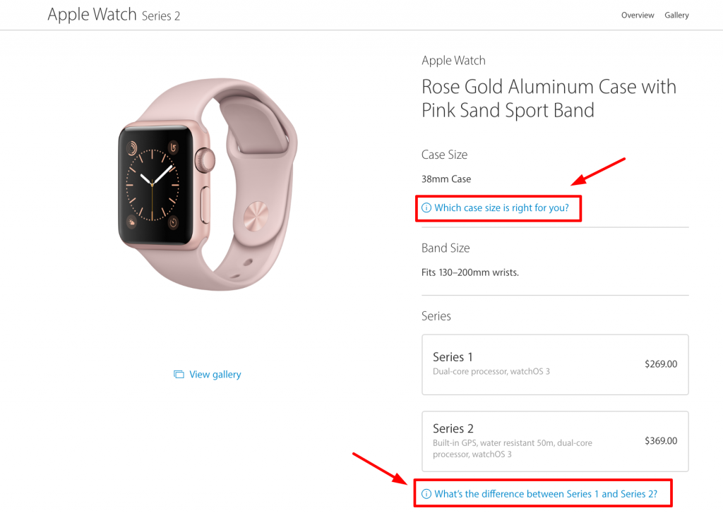
We can really notice that Apple created a masterpiece of a product page and a checkout page and I certainly encourage you to get inspired by it. First, the product page really interacts with the visitor and “speaks” in their own language. Just as Basecamp did in my previous example, Apple’s page product focus on the user. Instead of just a “size guide” we see “which case size is right for you?”
Then instead of just presenting information about series1 and series2, we see “what’s the difference between series1 and series2?”. The greatness of both of these phrases lay in their simpleness. It’s like everyday speaking and thinking, creating the feeling that YOU are in a shop and YOU are talking with a sales person.
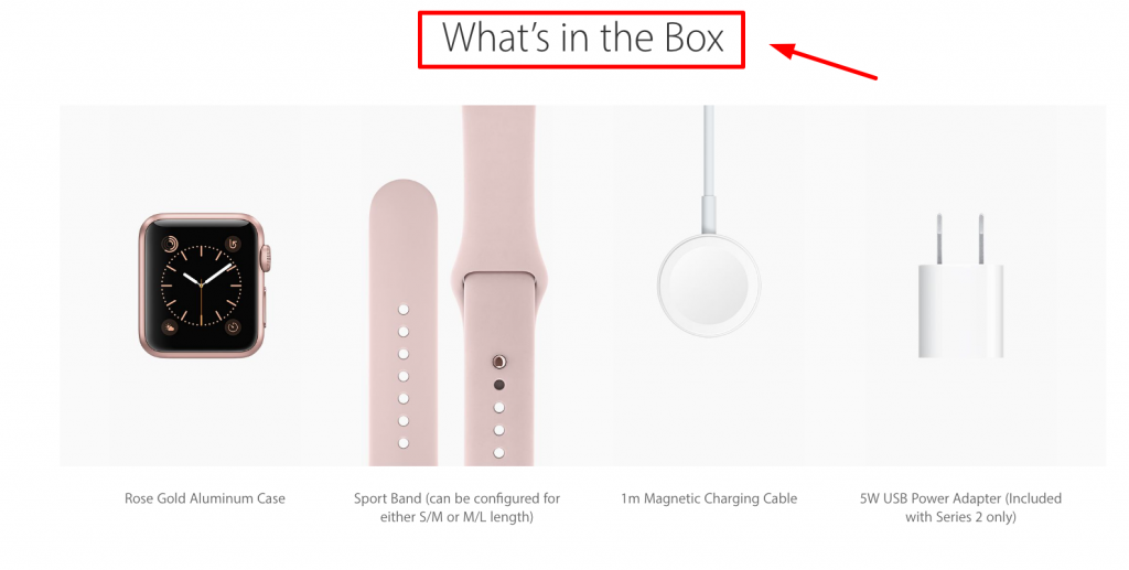
Scrolling down the product page we see the headline “what’s in the box?” Do you notice the method? Of questioning questions? Well, it keeps your visitor in the pace you want them to be. It makes them intrigued, sort of: question? Here is the full answer that can also be visual! That’s amazing in my opinion.
Example #2: Nike.com
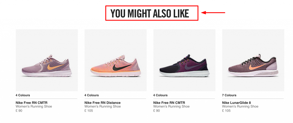
Nike.com also built an amazing product page and checkout funnel, so let’s review it:
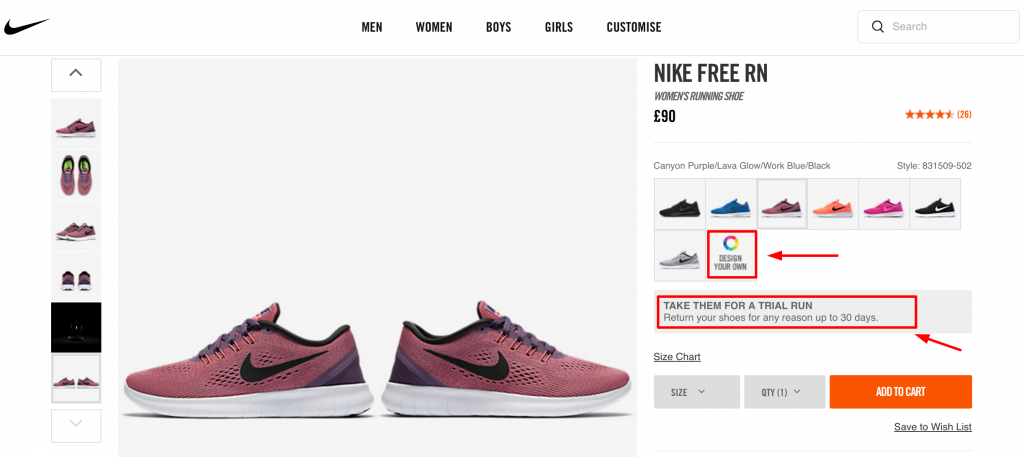
First we can see the phrase “Take them for a trail run return your shoes for any reason up to 30 days”. Instead of using the same old “return policy” they used micro-copy to create a double meaning that might make the visitor think “oh, cool, I needed a new pair of running shoes, and Nike let me run with these shoes for a whole month before I decide if I love them or not”.
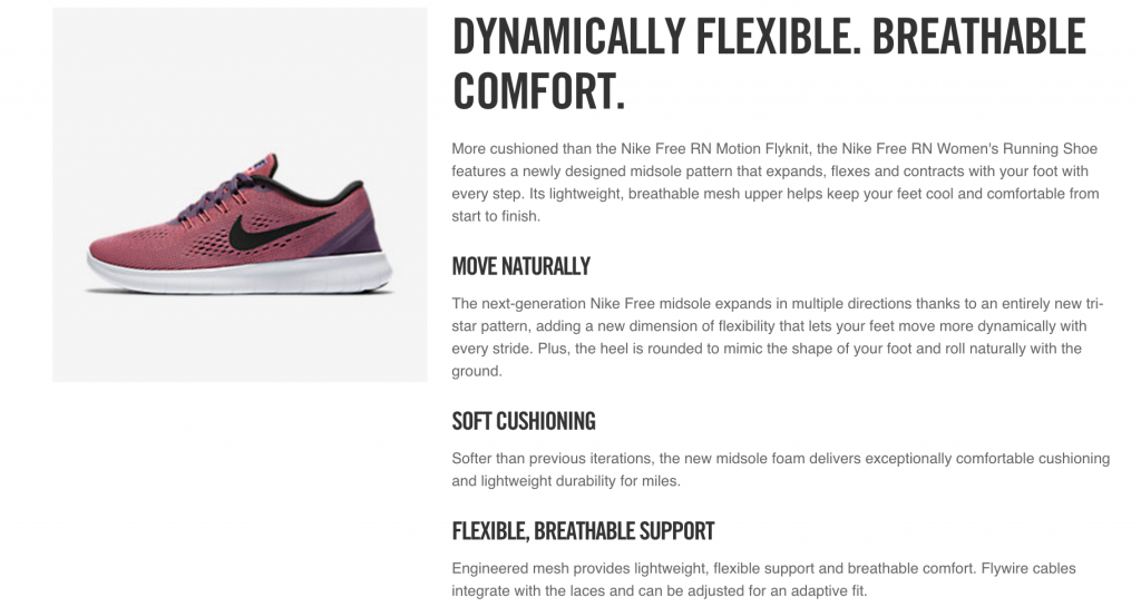
It’s a really cool CTA both for purchasing and for running. Scrolling down a bit leads us to a description text about the product which is cool but I won’t dwell on it because this post is about micro-copy.
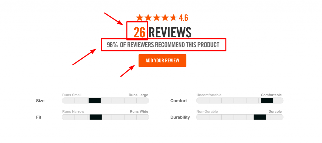
Further scrolling down the page, we reach the review section which is very well built! First, it tells us how many reviews this product has. Then comes the phrase “96% of reviewers recommend this product”.
Let’s linger on this micro-copy, which is amazing: even without reading any review – now your visitors know for sure this product is highly recommended!
Then we have the “Add your review” button. Again, making it about the visitor instead of the good old “add a review”.
Final words and takeouts
Now you know what micro-copy is, and how to implement it in your websites. So, to summarize our topic of how to use micro-copy to increase your conversions and brand strength, here’s a short dos and don’ts list:
-
Use “dead areas” in your website for branding it, but don’t push it. Having a witty 404 error page is great. Stuffing a small button with a bulky micro-copy text, not so great.
-
Make things easy for your visitors! If you want them to do something, i.e create a user name in a certain way, use micro-copy to show them how to do it. Don’t trust your visitors to do it by themselves.
-
Stay within context. Make sure your instructions and phrases are in the right context within the action you want your visitors to complete. Nothing’s worse than leading a visitor for an action that actually doesn’t really happen.
-
Think out loud, as if you were actually your visitor. In which words would you describe your user-flow? your expectations of what will happen next? your product CTA, and small phrases? Now, write this and use it.
-
As always – use A/B testing. Don’t assume anything. Start testing your micro-copy and check your visitors’ reaction.
How To Super-Boost Your Conversions Using Micro Copy 4.14/5 (82.86%) 7 votes
Related Posts


How To Super-Boost Your Conversions Using Micro Copy
Most of the time when we think about optimizing our branding method, we tend to be focused on our SEO keywords, content, headlines, images, colors and CTA buttons.
All of these are highly important, but in this post I want to reveal the importance of micro-copy on conversions, and how using it correctly can increase your conversions dramatically.
So, what is micro-copy?
Micro-copy is all the small, tiny words and sentences that on first sight seem meaningless for our visitors.
For example: contact form explainers, the text that is written right after the product description, 404 error pages, checkout pages and many more.
We tend not to think of these words as “a real content” or as a place to promote our brand, but the truth is that all of these words are unused opportunities to interact with our visitors.
Read closely this shirt laundry instructions and tell me what did you miss on first glance?
Just in case you’ve missed it… it’s written:
100% Cotton
Wash cold inside out
Hang out to dry
Call your mother
Why Micro Copy is so important to increase conversions?
Micro-copy gives you a special opportunity to reach out to your visitors, speaking in their language.
It can make visiting your website to a cool and fun experience, It will allow you to pop-out while everyone is doing more of the same dull and informative way of writing.
Micro-copy is targeted, short, lays within context – and it’s (almost) the best place you should use that will help you increase your conversions.
Some examples:
This is micro-copy:
Facebook is all about creating a space of your own, a place where you can share your thoughts. So in order to encourage people to interact and to share their minds, Facebook simply added “What’s on your mind?” and not the “Write here…” we usually see in text fields.
So is this:
This is a great example of taking all those tiny words and phrases that interact with your visitors and turn them into a great micro-copy, maximizing your website’s potential to it’s fullest. The headline is approachable and is written in a way people can feel sympathy. This text understands their needs!
Take a look again at the top of the form in the example. It informs us that signing up will be free. That helps solve in advance any uncertainty regarding pricing that may occur.
In the form, there’s the use of the words “your” and “my” which creates the feeling that this thing – is yours. It’s about you. Not others, and not the brand.
The last step of creating a password explains what to do in an easy, friendly way.
Here’s another example:
Classic Episode IV reference. In this 404 Error page, we have the nice illustration that let the visitors know the page does not exist anymore, then underneath it comes the micro-copy telling the visitor what he can search and find in Github.com.
Look at the micro-copy in Conversioner’s 404 page. Usually when people get to 404 pages they’re frustrated, but this page tells them to “not be upset” and recommends them to find “cool stuff” in the home page:
So now you understand what micro-copy is. What’s next?
My first advice: Use it.
Open your website and ask yourself: am I using a human’s or computer’s language? does the language I use contributes to the user experience? Is it unique? Is it inspiring or creates excitement or boring like all of my competitors? Is it written the way my visitors think?
I want you to linger a bit on the idea of your visitors way of thinking.
A Lot of time we tend to think that our website’s language is reachable and appropriate to the message we want to deliver. But I bet that if you really think about it – maybe you can make it better. So first, think as if YOU ARE the visitor.
Many times we are way too concern in our SEO campaigns and sticking to the SEO methods, writing blog posts in order to get more ranking and drive more traffic to our website.
So let me tell you something important about it – it’s ok, it’s important, but it’s not everything.
When you really think of it, maybe it’s not what your visitors expect or want from your website. If your website won’t measure up with your visitors expectations, well, probably they will move on to your competitors.
Micro-copy best practices
For your inspiration, I picked up some examples to review closely on how to use micro-copy in ways you didn’t even think about!
Example #1: Apple.com
We can really notice that Apple created a masterpiece of a product page and a checkout page and I certainly encourage you to get inspired by it. First, the product page really interacts with the visitor and “speaks” in their own language. Just as Basecamp did in my previous example, Apple’s page product focus on the user. Instead of just a “size guide” we see “which case size is right for you?”
Then instead of just presenting information about series1 and series2, we see “what’s the difference between series1 and series2?”. The greatness of both of these phrases lay in their simpleness. It’s like everyday speaking and thinking, creating the feeling that YOU are in a shop and YOU are talking with a sales person.
Scrolling down the product page we see the headline “what’s in the box?” Do you notice the method? Of questioning questions? Well, it keeps your visitor in the pace you want them to be. It makes them intrigued, sort of: question? Here is the full answer that can also be visual! That’s amazing in my opinion.
Example #2: Nike.com
Nike.com also built an amazing product page and checkout funnel, so let’s review it:
First we can see the phrase “Take them for a trail run return your shoes for any reason up to 30 days”. Instead of using the same old “return policy” they used micro-copy to create a double meaning that might make the visitor think “oh, cool, I needed a new pair of running shoes, and Nike let me run with these shoes for a whole month before I decide if I love them or not”.
It’s a really cool CTA both for purchasing and for running. Scrolling down a bit leads us to a description text about the product which is cool but I won’t dwell on it because this post is about micro-copy.
Further scrolling down the page, we reach the review section which is very well built! First, it tells us how many reviews this product has. Then comes the phrase “96% of reviewers recommend this product”.
Let’s linger on this micro-copy, which is amazing: even without reading any review – now your visitors know for sure this product is highly recommended!
Then we have the “Add your review” button. Again, making it about the visitor instead of the good old “add a review”.
Final words and takeouts
Now you know what micro-copy is, and how to implement it in your websites. So, to summarize our topic of how to use micro-copy to increase your conversions and brand strength, here’s a short dos and don’ts list:
Use “dead areas” in your website for branding it, but don’t push it. Having a witty 404 error page is great. Stuffing a small button with a bulky micro-copy text, not so great.
Make things easy for your visitors! If you want them to do something, i.e create a user name in a certain way, use micro-copy to show them how to do it. Don’t trust your visitors to do it by themselves.
Stay within context. Make sure your instructions and phrases are in the right context within the action you want your visitors to complete. Nothing’s worse than leading a visitor for an action that actually doesn’t really happen.
Think out loud, as if you were actually your visitor. In which words would you describe your user-flow? your expectations of what will happen next? your product CTA, and small phrases? Now, write this and use it.
As always – use A/B testing. Don’t assume anything. Start testing your micro-copy and check your visitors’ reaction.
Related Posts
Tags: