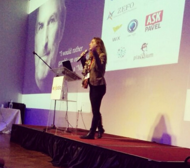
 About a month ago I gave a speech about emotional conversion optimization at the Nextcase convention. The purpose of the talk was to introduce marketers to the term of emotional targeting and get them considering their users feelings and triggers. I then received many questions and requests for additional user cases and explanation on emotional targeting. So below is a summary of the talk about the world of emotional conversion optimization and how to use it for your conversion efforts:
Behavioral Targeting
 Behavioral targeting in a nutshell refers to using data about users to increase conversion. When a user visits a web site, the pages they visit, the amount of time they view each page, the links they click on, the searches they make and the things that they interact with, allow sites to collect that data, and other factors,and create a technical profile of the user and then use it to segment their users. So in fact, when a user searches for Shoes on sale they’ll arrive on a page with shoes for sale for example.
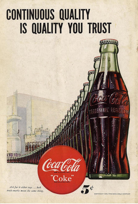
Take a look at this Coca Cola ad for example from the 1940’s: Coca cola selling a drink = Coca cola showing the drink
The world of behavioral targeting is what everyone’s talking about these days; some marketers refer to it as “personalization on the web”. Behavioral targeting is important, but it’s not close to being enough.
Emotional Targeting
 Emotional conversion optimization (Or Neuroscience) is built on the understanding that 90% of our decisions in life are irrational and that there are many psycho emotional triggers we aren’t aware of that can motivate us into taking action, like ‘loss aversion’ for example or ‘anchoring’. Understanding our users emotional triggers and feelings can help us improve our conversion dramatically.
Consider ads you see on TV for perfume, clothing or even Coca Cola- all driven by emotion. Mostly you won’t even see the product and it’s all about what it makes you feel not the product itself.
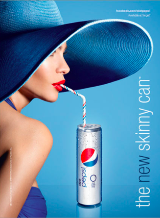
Below is an offline ad of Coca Cola from 2013: Other than the logo that we added to this ad, there is no reference to the drink.
 Sadly it’s 2014 and the world of online marketing is way behind and acts like the world of offline marketing in the 1940’s.
One of the most crucial statistics of 2013 was that the average “click to back” had decreased to 2.4 seconds. Meaning you have less than 3 seconds to convince users to stay on your site / buy your product.
And so, most online ads choose to show their product, talk about its features, why it’s better than their competitors and drop the emotional aspect.
Moving Offline to Online
When conversioner started out 5 years ago our mission was to bring the offline emotional world to the online world. By running an in-depth emotional research we are able to profile users according to their psycho emotional triggers and use different messaging and design to triggers these emotions and create action.
An action can be anything from a signup, higher open rate of an email, buying a product or sharing it.
Case Study
 The world of Binary Options is an extremely competitive one, there are hundreds companies in the industry and they’re ALL copying their competitors (here’s why they should stop that by the way). They all talk about the bonus you receive and the amount of money you will make by trading binary options.
Our goal: Increase deposits
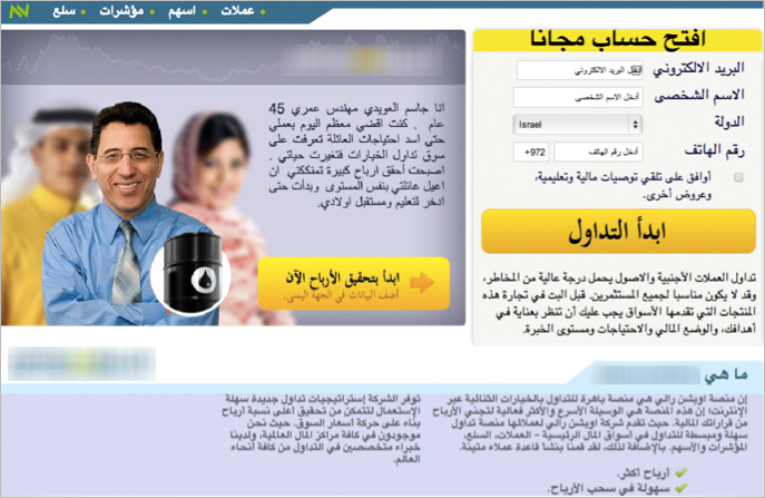
The client’s original page contained functional texts and visuals:
- Title: Open an account today and profit up to 78%
- Call to action: Why not click and deposit?
- The testimonials: “I won x amount of money”
All very mechanical, technical and to the point.
The Test
Following our psycho emotional triggers research we started designing new landing pages for testing. I will elaborate on all the test plan step by step in the next post but for now, I can tell you that first round of tests increased revenue by 37% and the entire test increased revenue by 300%.
We created 2 landing pages with the same title: Your Golden Opportunity Has Arrived. And changed only one thing, one page had a women in it and the other a man.
 Which one do you think won?
Part 2 is out, check it out here.
How We Increased Revenue By 300% Step by Step – Part 1 5.00/5 (100.00%) 10 votes
Related Posts


How We Increased Revenue By 300% Step by Step – Part 1
Behavioral Targeting
Take a look at this Coca Cola ad for example from the 1940’s: Coca cola selling a drink = Coca cola showing the drink
The world of behavioral targeting is what everyone’s talking about these days; some marketers refer to it as “personalization on the web”. Behavioral targeting is important, but it’s not close to being enough.
Emotional Targeting
Consider ads you see on TV for perfume, clothing or even Coca Cola- all driven by emotion. Mostly you won’t even see the product and it’s all about what it makes you feel not the product itself.
Below is an offline ad of Coca Cola from 2013: Other than the logo that we added to this ad, there is no reference to the drink.
One of the most crucial statistics of 2013 was that the average “click to back” had decreased to 2.4 seconds. Meaning you have less than 3 seconds to convince users to stay on your site / buy your product.
And so, most online ads choose to show their product, talk about its features, why it’s better than their competitors and drop the emotional aspect.
Moving Offline to Online
When conversioner started out 5 years ago our mission was to bring the offline emotional world to the online world. By running an in-depth emotional research we are able to profile users according to their psycho emotional triggers and use different messaging and design to triggers these emotions and create action.
An action can be anything from a signup, higher open rate of an email, buying a product or sharing it.
Case Study
Our goal: Increase deposits
The client’s original page contained functional texts and visuals:
All very mechanical, technical and to the point.
The Test
Following our psycho emotional triggers research we started designing new landing pages for testing. I will elaborate on all the test plan step by step in the next post but for now, I can tell you that first round of tests increased revenue by 37% and the entire test increased revenue by 300%.
We created 2 landing pages with the same title: Your Golden Opportunity Has Arrived. And changed only one thing, one page had a women in it and the other a man.
Part 2 is out, check it out here.
Related Posts
Tags: