In our latest post we discussed the importance of creating a complete funnel. Whether it’s creating banners which compliment the landing page or adding thank you pages to the process, there are many ways to create an holistic experience for your user that will increase conversion. Many people are reluctant to add an additional step in the funnel, such as thank you pages but in fact we’ve proven time and time again that you can Increase ROI With Thank You Pages.
Thank you pages offer a unique way to continue the interaction between your site and your clients once they’ve completed a process on your landing page. Whether it’s a lead generation landing page or an ecommerce shopping cart, the user experience can be compromised if there isn’t an appropriate closure. It’s like eating at a restaurant and not being greeted “goodbye” when you leave.
The thank you page is a wonderful place to go the extra mile and ask or offer something to your users. We’ve ran many tests in the past few years on thank you pages and learned users are very open and receptive for requests in that particular point in the funnel.
How to create thank you pages that increase ROI
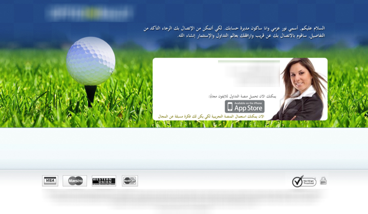
- Lead validation – Thank you pages are one of the best ways to avoid spam and allow users to insert their information correctly. As you can see in our earlier post “how we increased our client’s revenue by 300%”, the thank you page was a fantastic way to revalidate the lead and make sure people entered their right information. You’d be surprised of the amount of people who fill in this part. The thank you page (below) contained a short note thanking the users for signing up and asking them to verify their email and state when would be the best time to call. Users who answered this “poll” were 94% more prone to convert into actual customers than the ones that didn’t.
- Sell more
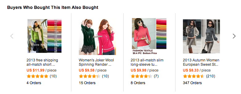
- Cross-selling, as well as upselling provides the opportunity for product recommendations unique to your shopper. For example once you purchase a tablet you’re immediately offered a cover and screen protector (known as cross sale) and of course, offered to upgrade your memory to 32GB instead of 16GB (an upsell). ‘Aliexpress’ is a great example of getting the customers back immediately after purchase with their product suggestions. One example is showing shoppers what other items were bought by other shoppers. Thus giving it a social stamp and offering additional products to compliment.
- The Gift – Another trick is the ever-popular coupon code for repurchasing, and not forgetting the gift coupon to shop again. You can also offer them a free whitepaper to download or like dropbox offer more backup space for referring it to a friend.
Remember that one of the strongest cognitive biases is Loss Aversion, which refers to people’s tendency to strongly prefer avoiding losses to acquiring gains – we don’t want to miss out on a sale, we’ve already paid or signed up for something then why not continue?
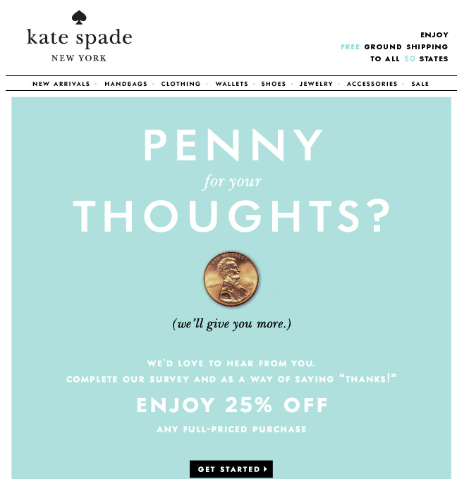
- Learn your users – The thank you page is a great place to get to know your users better, understand what they’re looking for and help them achieve it. Once an order has been placed, the perfect moment exists to ask the customer about his or her shopping experience: include a sign-up for more information or a newsletter on featured products for a powered-up conversion campaign. For example in one of our latest tests we asked users to answer 5 personal questions regarding their experience and over 60% of the users answered that survey, which was a huge surprise. This information can now further be used to create better experiences for our client’s audience. Check out this awesome example by Kate Spade for getting information about your audience and giving them a coupon!
- Signups - A great value to a purchase is getting customers to sign up and create an account. One way is offering to sign up before purchasing the product but some customers are hesitant to do so and prefer to purchase as a guest. Once they’ve made the purchase, the thank you page should be your place to try again. Make it worth their while to sign up by rewarding them with loyalty points or a coupon. To create converting registration forms and getting more signups, check out this article.
- Sharing – Our previous post covered 5 emotional marketing tricks our brains play on us, one of them is the tendency of people to attribute a positive perspective to a decision they’ve made (choice supportive) so this is the best time to get them to share their amazing purchase. Get your customers to share their experience on all social media platforms. Offer amusing messaging to share on Facebook, twitter or G+. Another option is raffling a free gift between all customers who share. Offering a variety of sharing options, allows for different types of people to share their purchases – and so is some are reluctant to expose their buying choices on Facebook, they might do so privately by sending their purchases via email.
The thank you page appears at the most critical point of the sale and can have the highest rate of engagement if built right. Maintaining thank you pages and building them correctly can take time but if you put enough though into them, they’re worth the work and hassle. Keep your customers coming back, learn about them and increase your revenue while doing so.
Keep Customers Buying: 5 Ways to Increase ROI With Thank You Pages 5.00/5 (100.00%) 6 votes
Related Posts


Keep Customers Buying: 5 Ways to Increase ROI With Thank You Pages
In our latest post we discussed the importance of creating a complete funnel. Whether it’s creating banners which compliment the landing page or adding thank you pages to the process, there are many ways to create an holistic experience for your user that will increase conversion. Many people are reluctant to add an additional step in the funnel, such as thank you pages but in fact we’ve proven time and time again that you can Increase ROI With Thank You Pages.
Thank you pages offer a unique way to continue the interaction between your site and your clients once they’ve completed a process on your landing page. Whether it’s a lead generation landing page or an ecommerce shopping cart, the user experience can be compromised if there isn’t an appropriate closure. It’s like eating at a restaurant and not being greeted “goodbye” when you leave.
The thank you page is a wonderful place to go the extra mile and ask or offer something to your users. We’ve ran many tests in the past few years on thank you pages and learned users are very open and receptive for requests in that particular point in the funnel.
How to create thank you pages that increase ROI
Remember that one of the strongest cognitive biases is Loss Aversion, which refers to people’s tendency to strongly prefer avoiding losses to acquiring gains – we don’t want to miss out on a sale, we’ve already paid or signed up for something then why not continue?
The thank you page appears at the most critical point of the sale and can have the highest rate of engagement if built right. Maintaining thank you pages and building them correctly can take time but if you put enough though into them, they’re worth the work and hassle. Keep your customers coming back, learn about them and increase your revenue while doing so.
Related Posts
Tags: