 In my previous post I started discussing emotional conversion optimization and its value in increasing revenue. Following the questions and requests I received from the convention I decided to present one of our case studies and explain step by step how using emotional triggers can increase your revenue extremely.
As you know, we were discussing Binary Options, a very competitive field with hundreds of companies in the game trying to make money. As in many verticals, all binary option brands copy each other and create the same banners & landing pages as their competitors. Using emotional targeting we were able to create a different test flow ending with 300% increase in revenue.
The Emotional Research
Our research showed us that we needed to focus on the emotional value a trader would gain from using our client’s trading platform rather than the features and amount of money they would make. This is contrary to the entire industry’s beliefs that prefer to talk about the profit itself, show testimonials of people explaining how much they won and placing a lot of money in the creative to show richness.
Round #1
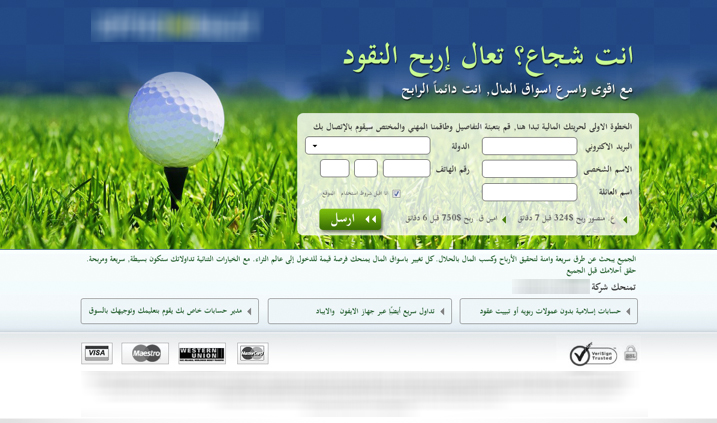
The first page we designed was focused on the emotional trigger: “Self Image”.
People that are triggered by self-image are people who consider themselves winners, successful, go-getters and think highly of themselves. Which is why we decided to dare them and make them prove they are who they think they are in our design and messaging.
- Title: Are you brave? Come Make Money
- Design: The golf ball symbolizes luxury and wealth and rather than having an image of someone hitting the golf ball we placed the ball in a “close-up” shot to trigger activism: Hit the ball yourself. The ball is waiting to be hit by you.
- The messaging on this page was more emotional, daring, with no regards to the amount of money they would make and with hardly any technical information.
- Result: 30% increase in deposits
The Importance of User Flow
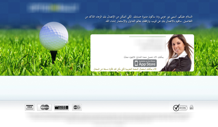
Following the first results we added a thank you page. Many marketers fear adding another step to the funnel, although this step is after they complete their registration it plays a huge part in the amount of deposits, the quality of the leads and the amount people invested.
A landing page doesn’t have to stand alone, each part of the user flow is important, whether it’s creating the right mobile pages for mobile traffic, thank you pages or even an exit pop up, they all have to be thought of and be part of a natural user flow.
In our test we placed an image of a sales representative on the thank you page saying she would like to call them and requesting users to insert their phone number and email again just to make sure they were right.
Users were also asked to state the time they prefer to be called at.
Results:
- Increase in conversion to deposit by 10%
- Increase in quality of leads by 23.4%.
Moving on we then created an additional landing page to run against the golf page. This page was targeting the same emotional trigger.
Round #2
This is the test I told you about in Part1 post, and asked you decide which page won, the women or the man.
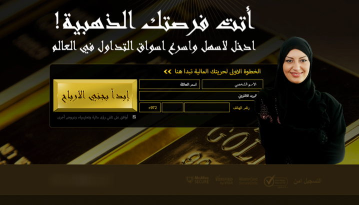
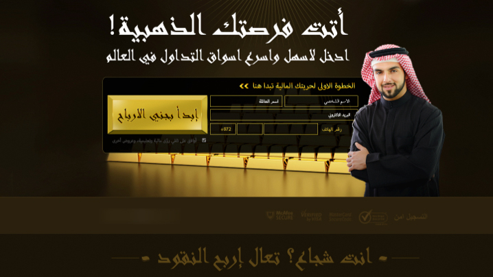
Title: Your golden opportunity has arrived
In this test we wanted to test the aspect of using gold in our landing pages and its effect on the conversion rate.
This landing page was designed for mobile, web, had its own thank you page and was designed in both female and male, and as you can see the winner was… the man!
- The female’s page converted by 20% more to deposit
- The male’s page converted by 37% more
Understanding Your Audience
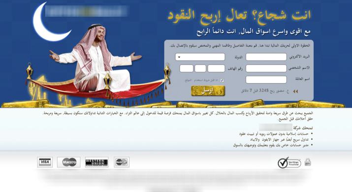
Last but not least was our Ramadan page. This page was designed for the Ramadan, one of the holiest holidays in the Arab calendar.
The landing page was designed to trigger the Social Image trigger; People who care a lot about what others think of them and will do a lot to be perceived as successful and better than others.
Title: Make Your Dreams Come True
Sub title: And the whole world will talk about your success
- Introducing humor to the world of binary options
- Using specific colors
- Using emotional texts
The result: 300% increase to deposit
Neuromarketing isn’t an exact science and there’s no specific formula you can follow. However, exposing the right psycho emotional triggers for your target audience can increase conversion by 100’s of percent’s.
Binary Options Landing Page Increases Revenues by 300% -Part 2 5.00/5 (100.00%) 6 votes
Related Posts


Binary Options Landing Page Increases Revenues by 300% -Part 2
As you know, we were discussing Binary Options, a very competitive field with hundreds of companies in the game trying to make money. As in many verticals, all binary option brands copy each other and create the same banners & landing pages as their competitors. Using emotional targeting we were able to create a different test flow ending with 300% increase in revenue.
The Emotional Research
Our research showed us that we needed to focus on the emotional value a trader would gain from using our client’s trading platform rather than the features and amount of money they would make. This is contrary to the entire industry’s beliefs that prefer to talk about the profit itself, show testimonials of people explaining how much they won and placing a lot of money in the creative to show richness.
Round #1
The first page we designed was focused on the emotional trigger: “Self Image”.
People that are triggered by self-image are people who consider themselves winners, successful, go-getters and think highly of themselves. Which is why we decided to dare them and make them prove they are who they think they are in our design and messaging.
The Importance of User Flow
Following the first results we added a thank you page. Many marketers fear adding another step to the funnel, although this step is after they complete their registration it plays a huge part in the amount of deposits, the quality of the leads and the amount people invested.
A landing page doesn’t have to stand alone, each part of the user flow is important, whether it’s creating the right mobile pages for mobile traffic, thank you pages or even an exit pop up, they all have to be thought of and be part of a natural user flow.
In our test we placed an image of a sales representative on the thank you page saying she would like to call them and requesting users to insert their phone number and email again just to make sure they were right.
Users were also asked to state the time they prefer to be called at.
Results:
Moving on we then created an additional landing page to run against the golf page. This page was targeting the same emotional trigger.
Round #2
This is the test I told you about in Part1 post, and asked you decide which page won, the women or the man.
Title: Your golden opportunity has arrived
In this test we wanted to test the aspect of using gold in our landing pages and its effect on the conversion rate.
This landing page was designed for mobile, web, had its own thank you page and was designed in both female and male, and as you can see the winner was… the man!
Understanding Your Audience
Last but not least was our Ramadan page. This page was designed for the Ramadan, one of the holiest holidays in the Arab calendar.
The landing page was designed to trigger the Social Image trigger; People who care a lot about what others think of them and will do a lot to be perceived as successful and better than others.
Title: Make Your Dreams Come True
Sub title: And the whole world will talk about your success
The result: 300% increase to deposit
Neuromarketing isn’t an exact science and there’s no specific formula you can follow. However, exposing the right psycho emotional triggers for your target audience can increase conversion by 100’s of percent’s.
Related Posts
Tags: