How Web Page Design Can Enhance Your Business Operation
Businesses can underestimate the ability of responsive web design to convert leads, increase user engagement, and ultimately create more sales in their e-commerce stores.
Optimizing your website for ecommerce ultimately makes it easier for your customers to make purchases, and can even inspire brand loyalty.
Ecommerce optimization is an essential aspect of your website marketing plan, but it’s a practice that takes the assistance of a web design company. Here’s what you need to know about improving your business website:
How To Design A Website With Ecommerce In Mind
An ecommerce website must be easy to navigate, help customers find what they’re looking for, and encourage them to make a purchase.
This sounds like a tall order, but utilizing a few actionable tips can help you navigate your customer through their buying journey.
High-quality web design helps customers through the purchasing funnel and ultimately increases your revenue.
1. Allow Customers To Leave Product Reviews
We all like to do our research before making any buying decisions. When was the last time you made a buying decision without reading other people’s experiences, first?
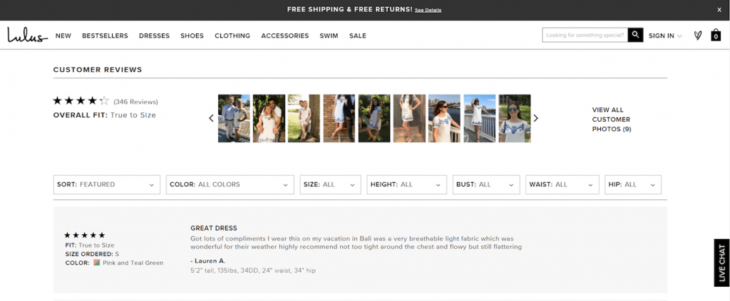
Product reviews help establish trust for your brand, but they also provide valuable information to your user.
Clothing stores especially can benefit from utilizing product review functionality. Buyers can learn more about fit, length, and color before making their buying decision, which ultimately leads to more purchases:
2. Give Users Enough White Space
Creating enough white space between your products can make a world of difference on your e-commerce website.
If you provide your users with too many options, spaced closely together, you could overwhelm them and stop the buying process.
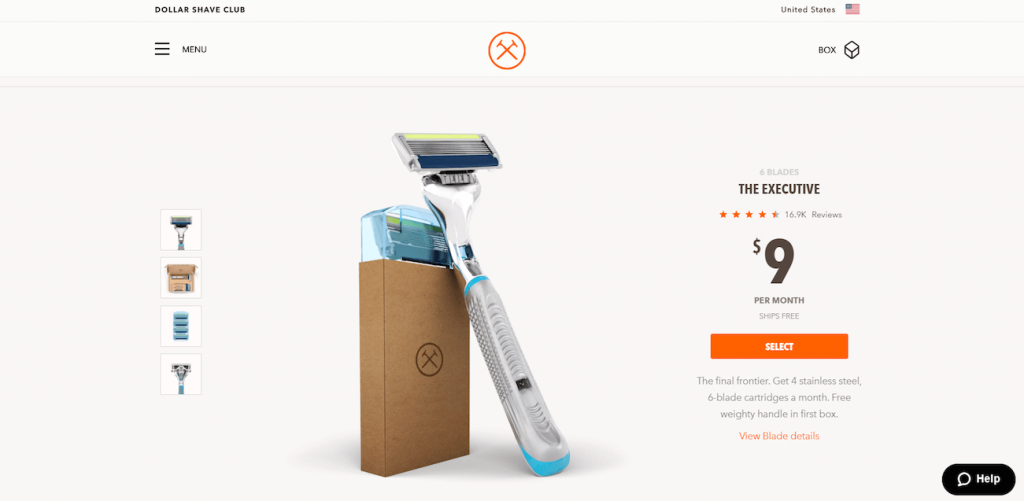
Grid views of products, using large images spaced evenly apart, creates visual appeal that helps your users make buying decisions – not detract them from making a purchase.
Notice how the Dollar Shave Club site includes plenty of white space and features large images in their product page, presenting their products without overwhelming the user:
3. Use High-Quality Photography
In the same vein, make sure your photos are of the highest quality when creating your product pages.
Ecommerce is in the business of enticing customers to make purchases online. Often, the customer does not get to touch or see the product until it arrives on his or her doorstep.
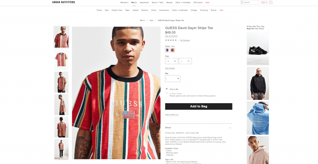
Including quality, high-resolution images (instead of just taking something generic from a free stock images websites) provides the best representation of the product and increases the likelihood that a customer will buy it.
The best product images utilize multiple angles and provide all the information a user needs to make a purchase.
Opt for a product slideshow or tiled thumbnails your user can flip through to get a 360-degree representation of what you’re selling – it’s the closest they can come to seeing it in-person.
Be wary of blurry or pixelated images, which will send users off your site. An ecommerce web designer can help you take high quality photos and arrange them on your site.
4. Add “Related Products” To Encourage Purchases
After reading about a product’s specification or reviews, a customer may decide that the item they searched for won’t work for them.
Instead of giving them an excuse to navigate away to a competitor, show them other possibilities.
Related product suggestions can serve several purposes: first, it can provide viable alternatives, such as different sizes or dimensions, that will work better for the prospective customer.
Second, it provides suggestions for complementary products, such as a wall mount for a new TV.
Amazon does a good job at presenting customers with options for both related and complementary products:
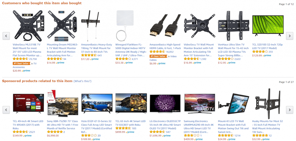
Here, customers have a place to compare different TV sizes, specs, and price points.
They also have the option of adding a swivel mount to their cart, which increases the sale for the business. It’s convenient for the user, and drives sales.
5. Make Your Website Easy To Navigate
High-quality web design starts with intuition in mind.
Your website must be simple for customers to navigate and connect with your full array of products and services.
For your ecommerce store, this means organizing your products into top navigation with drop-down menus and fly-out menus.
Drop-down menus present categories vertically, and fly-out menus present more options within the category horizontally.
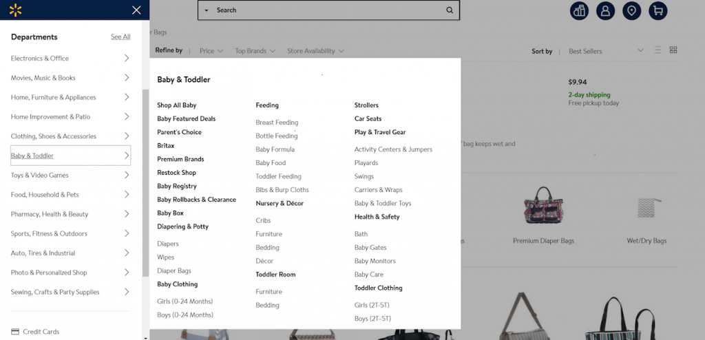
Your top level navigation menu should include general product categories such as baby, shoes, or hardware.
Your fly-out menus can become more specific: for example, “diapers and wipes,” “nursery furniture,” or “feeding.” Creating easy to navigate menus requires professional web development help, but it’s well worth the effort.
6. Keep Your Branding Consistent
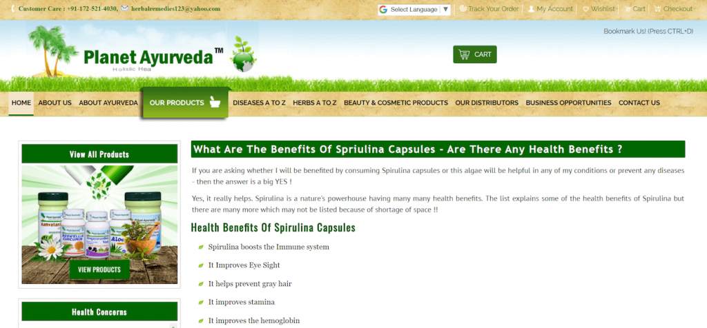
Finally, make sure that your e-commerce website’s color scheme and branding fits your brand, and use it to evoke certain emotions and even to influence buying decisions.
Your color scheme can say a lot about you and influences your buyers on a subconscious level. Health brands, for example, benefit from a green color scheme, which communicates good health, wealth, and happiness:
Blue color schemes evoke feelings of dependability and loyalty, while purple and pink can communicate optimism and social consciousness.
Yellow and orange hues create a sense of warmth. Keep this color scheme consistent as you create your search functions and product pages; it will help customers identify you with the feelings you’re trying to create, no matter where they are on your website.
Conclusion
Ecommerce optimization can help customers find your products and make purchasing decisions. By adding product suggestions, using high-quality photos, and making your site easy to navigate, you could notice a significant difference in revenue.
About The Author: Nicola Yap lives in Phoenix, Arizona with her two cats Marcie and Lambert. When she isn’t writing blog posts, she’s probably playing video games or doing something as equally unproductive. She works as an organic marketing strategist for Eminent SEO, a full-service digital marketing agency that creates custom websites and innovative marketing solutions for small to medium-sized businesses that are looking for impactful results.
Enhance Your E-Commerce Optimization with these 6 Web Design Fundamentals 3.26/5 (65.26%) 19 votes
Related Posts


Enhance Your E-Commerce Optimization with these 6 Web Design Fundamentals
How Web Page Design Can Enhance Your Business Operation
Businesses can underestimate the ability of responsive web design to convert leads, increase user engagement, and ultimately create more sales in their e-commerce stores.
Optimizing your website for ecommerce ultimately makes it easier for your customers to make purchases, and can even inspire brand loyalty.
Ecommerce optimization is an essential aspect of your website marketing plan, but it’s a practice that takes the assistance of a web design company. Here’s what you need to know about improving your business website:
How To Design A Website With Ecommerce In Mind
An ecommerce website must be easy to navigate, help customers find what they’re looking for, and encourage them to make a purchase.
This sounds like a tall order, but utilizing a few actionable tips can help you navigate your customer through their buying journey.
High-quality web design helps customers through the purchasing funnel and ultimately increases your revenue.
1. Allow Customers To Leave Product Reviews
We all like to do our research before making any buying decisions. When was the last time you made a buying decision without reading other people’s experiences, first?
Product reviews help establish trust for your brand, but they also provide valuable information to your user.
Clothing stores especially can benefit from utilizing product review functionality. Buyers can learn more about fit, length, and color before making their buying decision, which ultimately leads to more purchases:
2. Give Users Enough White Space
Creating enough white space between your products can make a world of difference on your e-commerce website.
If you provide your users with too many options, spaced closely together, you could overwhelm them and stop the buying process.
Grid views of products, using large images spaced evenly apart, creates visual appeal that helps your users make buying decisions – not detract them from making a purchase.
Notice how the Dollar Shave Club site includes plenty of white space and features large images in their product page, presenting their products without overwhelming the user:
3. Use High-Quality Photography
In the same vein, make sure your photos are of the highest quality when creating your product pages.
Ecommerce is in the business of enticing customers to make purchases online. Often, the customer does not get to touch or see the product until it arrives on his or her doorstep.
Including quality, high-resolution images (instead of just taking something generic from a free stock images websites) provides the best representation of the product and increases the likelihood that a customer will buy it.
The best product images utilize multiple angles and provide all the information a user needs to make a purchase.
Opt for a product slideshow or tiled thumbnails your user can flip through to get a 360-degree representation of what you’re selling – it’s the closest they can come to seeing it in-person.
Be wary of blurry or pixelated images, which will send users off your site. An ecommerce web designer can help you take high quality photos and arrange them on your site.
4. Add “Related Products” To Encourage Purchases
After reading about a product’s specification or reviews, a customer may decide that the item they searched for won’t work for them.
Instead of giving them an excuse to navigate away to a competitor, show them other possibilities.
Related product suggestions can serve several purposes: first, it can provide viable alternatives, such as different sizes or dimensions, that will work better for the prospective customer.
Second, it provides suggestions for complementary products, such as a wall mount for a new TV.
Amazon does a good job at presenting customers with options for both related and complementary products:
Here, customers have a place to compare different TV sizes, specs, and price points.
They also have the option of adding a swivel mount to their cart, which increases the sale for the business. It’s convenient for the user, and drives sales.
5. Make Your Website Easy To Navigate
High-quality web design starts with intuition in mind.
Your website must be simple for customers to navigate and connect with your full array of products and services.
For your ecommerce store, this means organizing your products into top navigation with drop-down menus and fly-out menus.
Drop-down menus present categories vertically, and fly-out menus present more options within the category horizontally.
Your top level navigation menu should include general product categories such as baby, shoes, or hardware.
Your fly-out menus can become more specific: for example, “diapers and wipes,” “nursery furniture,” or “feeding.” Creating easy to navigate menus requires professional web development help, but it’s well worth the effort.
6. Keep Your Branding Consistent
Finally, make sure that your e-commerce website’s color scheme and branding fits your brand, and use it to evoke certain emotions and even to influence buying decisions.
Your color scheme can say a lot about you and influences your buyers on a subconscious level. Health brands, for example, benefit from a green color scheme, which communicates good health, wealth, and happiness:
Blue color schemes evoke feelings of dependability and loyalty, while purple and pink can communicate optimism and social consciousness.
Yellow and orange hues create a sense of warmth. Keep this color scheme consistent as you create your search functions and product pages; it will help customers identify you with the feelings you’re trying to create, no matter where they are on your website.
Conclusion
Ecommerce optimization can help customers find your products and make purchasing decisions. By adding product suggestions, using high-quality photos, and making your site easy to navigate, you could notice a significant difference in revenue.
About The Author: Nicola Yap lives in Phoenix, Arizona with her two cats Marcie and Lambert. When she isn’t writing blog posts, she’s probably playing video games or doing something as equally unproductive. She works as an organic marketing strategist for Eminent SEO, a full-service digital marketing agency that creates custom websites and innovative marketing solutions for small to medium-sized businesses that are looking for impactful results.
Related Posts
Tags: