The large penetration of smartphones has made email (and email marketing) a present and useful part of our lives, even better than instant messaging or SMS. Here are a few interesting statistics about email usage that demonstrate how important and prominent this form of communication has become in our lives:
- In 2013 there were over 2.4 billion email users
- 182 billion email messages are sent each day (tweet this)
- Over 74% of adults today prefer email as a method for commercial communication (tweet this)
- 48% of emails are opened on a mobile phone first (tweet this)
- Most emails are opened within the first hour of their arrival
Email Marketing Pros & Cons
These numbers emphasize how important email marketing is in our online marketing strategy, so there are a few important features of this platform that we have to keep in mind.
While providing a direct and less intrusive way to engage with our clients, emails also provide the recipients with a greater amount of control over what they choose to receive, and what they choose to open and read.
Have you ever tried ignoring an IM or SMS message? Admit it, it will take a great toll on your nerves until you can revisit. In addition, blocking text messages on our phones can be tricky. Ignoring an email however, or blocking an unwanted sender, well that’s usually an easy task.
Email marketing can have tremendous influence on our conversions if used properly. This is why we should be well aware of some important guidelines in order to eventually achieve conversions using email marketing.
4 Email Metrics You Should Follow
There are many different metrics you can track and analyze in your email marketing campaigns, but there are several important email conversions metrics you should pay attention to:
- Open rate – How many of the recipients opened the emailץ
- Click-through-rate – how many of the openers have clicked on the major CTAs.
- Opt-out rate – how many of the recipients have asked to unsubscribe from the mailing list.
Of course email opens and clicks are important micro-conversions, but always keep in mind that the real long-term metric is your email marketing’s contribution to overall conversions, i.e. leads or sales, on your website and landing pages.
So the last and most important metric you should follow is:
- Website conversions – how many of your conversions originated from an email referral.
Optimizing your email marketing activity means getting more opens and more clicks, keeping a low opt-out rate, and making more conversions in general.
5 ways to boost email marketing conversions:
1. Deliver emails when your customers are available to read them
People’s attention shifts during different hours of the day, according to their schedule and activities, so it’s important to carefully consider the point in time in which your messages are being sent.
The following describe how email opening rates vary between days of the week, as well as during different hours of the day:
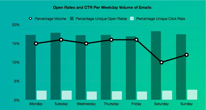
Another important statistic to take into account is that the majority of email opens will occur within 1 hour after arrival, so timing your email messages to right time and day for your target audience is important.
Key Takeaways
- The timing of your email deliveries should be adjusted to your users’ schedule, not yours. Aim your delivery to day and time in which you users are available to read and engage with your email. Choosing the right time will of course lead to better conversions.
- Planning ahead can be very productive. For marketers who maintain extensive email marketing, it is highly recommended to prepare a weekly and monthly editorial schedule – rather than improvising and sending at the last minute, or sending medium to poor content.
- Test for your mailing list’s ideal timing. Each company and each mailing list are unique. Always test different delivery times with different contents, and check what works best for your specific audience if you want to see conversions increase.
2. Personalize Your Emails
According to an extensive study conducted by Experian during 2013 Personalized promotional mailings have 29% higher unique open rates and 41% higher unique click rates than non-personalized mailings (tweet this).
According to another study by Hubspot, simply adding your customer’s first name in the subject line of your message can drive an additional 1.5% to your CTR (tweet this), which could sometimes make all the difference.
What we learn from this is that people like to be treated as individuals, and so communication that they feel is aimed directly for them and their needs is more likely to get their attention.
Key Takeaways
- Make sure to collect every piece of information you can about your customers and prospects, and make sure to document it in your mailing system.
- When drafting your email message think what kind of offers and content you can provide based on personal information (that wouldn’t be too creepy).Birthdays and anniversaries, as well as holidays, make excellent opportunities to offer a coupon or other promotional offers.Of course using the recipient’s first name as we mentioned can be very effective – just make sure you have the right name!
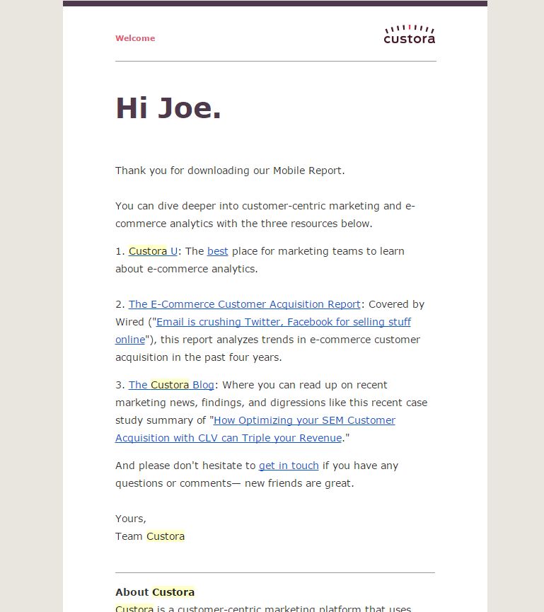
Check out how Custora personalize their emails:
3. Don’t Neglect 48% of Your Users
According to a study by Lithmus, mobile usage accounts for 48% of email opens, gaining a 10% rise from 2012 to 2013 (tweet this).
As smartphones and tablets are growing in numbers, this number is expected to continue growing. Another important thing to know is that approx. 80% of recipients delete an email if they find it looks bad on their mobile device.
check out this important article about mobile conversion optimization.
This is what happens when you forget your mobile users
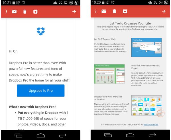
Notice how Dropbox’s email is clean, easy to read and provides a big, clear CTA straight away. On the other hand, Trello’s email is clearly not designed with mobile in mind – there’s no clear CTA and the text is small and impossible to read without zooming.
The images are also not optimized for mobile view; they get readjusted and appear so small that they are nothing more than a colorful blur.
Key Takeaways
- Don’t use fixed image width. If you fix an image width, say, on 600 pixels, while most devices show no more than 320 pixels, it will inevitably lead to horizontal scrolling, which you probably know is rather annoying on the small mobile screen. Some mobile email clients don’t even allow it, making your email impossible to view.
- Don’t rely on image based elements such as buttons, and definitely don’t base your entire email message on a single image, as some mobile email clients only show text (by the way, this is true for desktop email design all the same)
.
- Take font size into consideration, as it’s hard to read small fonts on mobile devices, and zooming in order to read can be annoying and tricky. A font size of 17-22 pixels is usually recommended.
- Keep your email conversion-oriented. Your user don’t have to guess what you expected them to do, and they definitely don’t need to make an effort in order to do it. Make sure to Keep the main CTA above the fold and make it crystal clear, big and easy to click on.
4. Make sure your message can be seen
Most web based email providers (Gmail, Yahoo Mail, Outlook.com) as well as Microsoft Outlook block images by default as a security measure, only showing them after the user approves them.
This means that if your email message is based solely on a large image, there’s a good chance your user will initially see, well, nothing!
The way to deal with this obstacle is actually not that complicated. Your emails should be based on live text, with images as supporting elements. No more promotional emails that are based solely on a large image.
Other than using live text, all of the images within your email message should have “alt” tags that describe either what the image is showing or the action that it asks the user to perform (in case the image is a button with call-to-action).
See how image can make or break your email design:
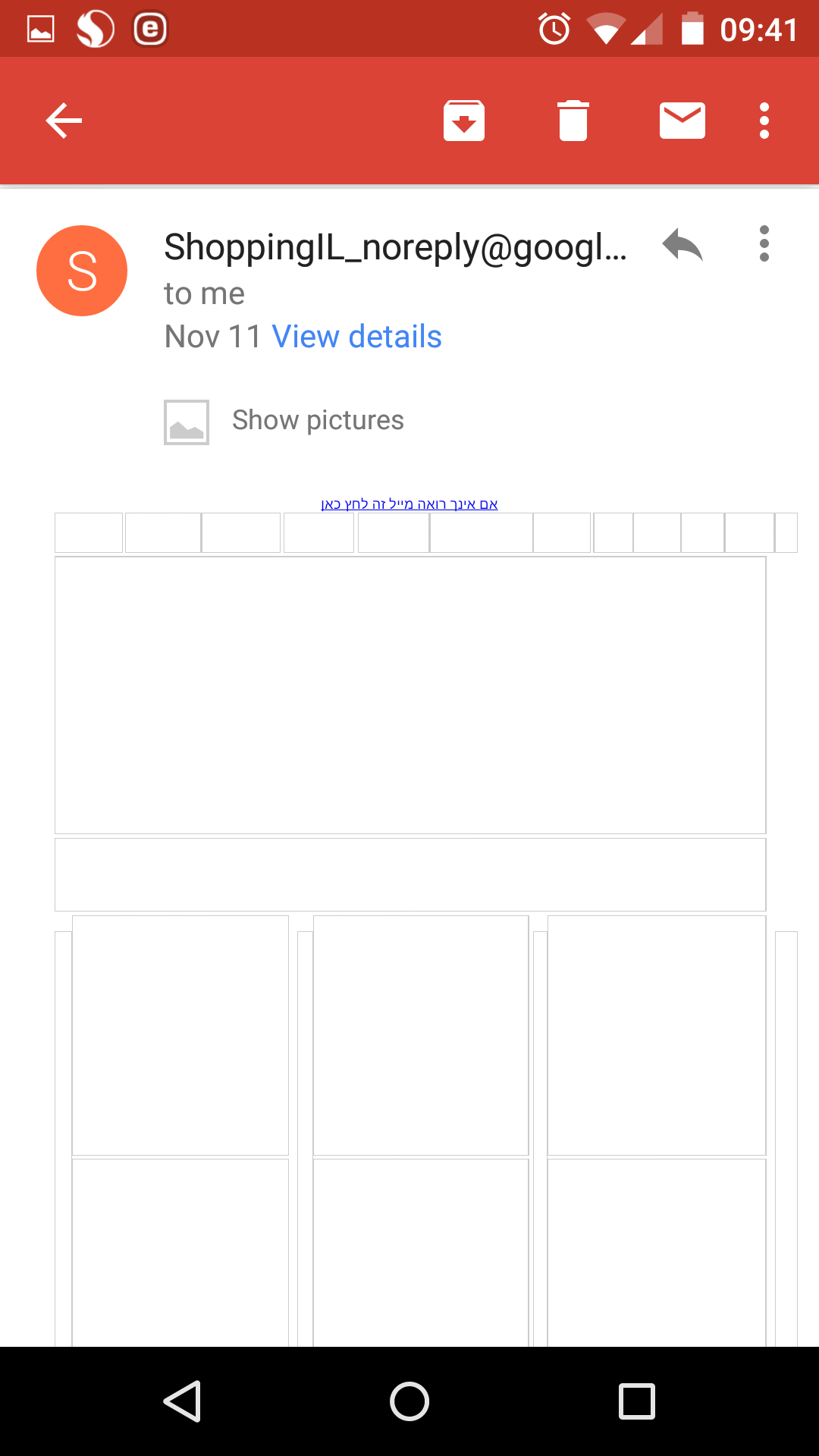
The entire message is based on images, and since my email is set not to display them by default I have absolutely no Idea what they have to say or offer me here. this is a waste of my time and their effort.
This dramatically reduces the chances a conversion will take place.
Now check out the email from Dropbox I presented earlier when the images are disabled. Notice that other than the Dropbox logo not showing, everything else look exactly the same:
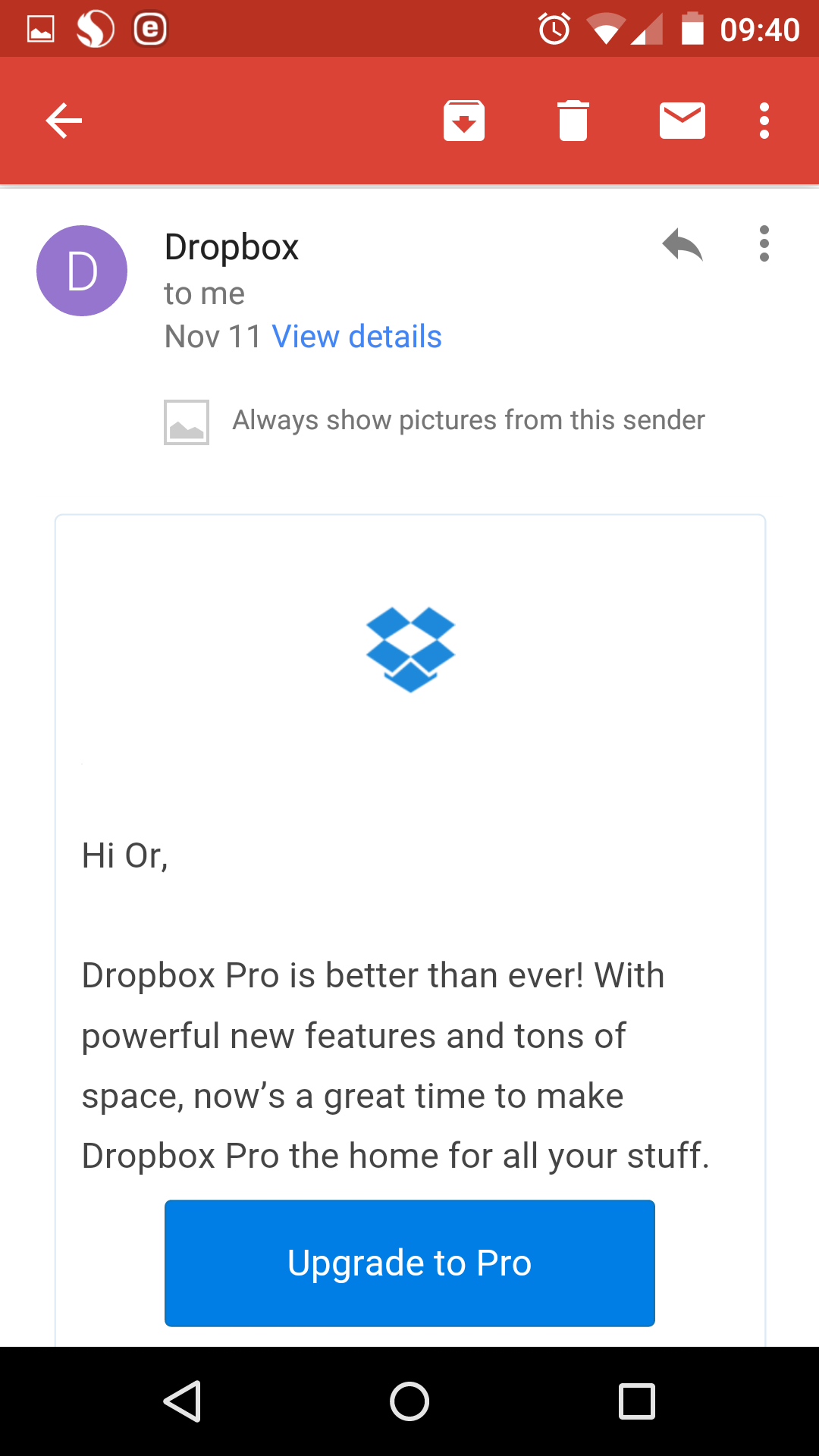
Most importantly – the call-to action is text-based, so I can still see, and it also states exactly where it will lead me – so there’s no doubt as to the message’s purpose.
Here’s what Fiverr’s promotional email looks like, with images enabled (on the left) and disabled (on the right):
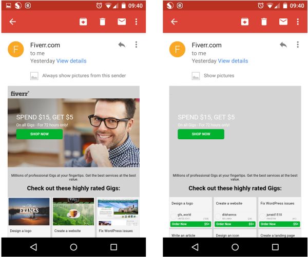
Notice that although the images are not displayed, all of the important information is available, easy to read and understand, and presented with smart usage of live text and image “alt” text.
There’s a clear unique selling proposition that is easy to see without enabling images, as well as the “order now” call-to-action on the items below.
I am positive the these email messages are showing great conversion results.
Key Takeaways
- Prefer live text over images and elaborate design in your emails. Use image only as supportive elements, rather than as containers for the main message.
- Make sure to provide “alt” text describing what the image is about. That way if your image isn’t showing, the “alt” text will, so the user will not receive an empty email.
- Even if images are a major part of your message, at least 2 elements of your email must be based on live text – the selling proposition – i.e. what your email is about, and the call-to-action. (Learn more about call-to-action best practice)
5. E-commerce Email Re-targeting
When a user enters an e-commerce website, piles products into his virtual shopping cart, heads towards the checkout and then suddenly leaves, obviously something happened.
Maybe this was the first time he saw the shipping costs, maybe something else diverted his attention and he forgot to come back and finish the experience. Either way, he did not complete his purchase.
You shouldn’t get disheartened when this happens, as this study (and many others) shows that 99% of new visitors on e-commerce websites do not purchase on their first visit (tweet this).
What you should be concerned about is how to make the new visitor become a returning one, keeping in mind that of those abandoners that eventually complete their purchase, 72% of them do so within 24 hours.
This is where smart and personalized email marketing comes into play, more accurately referred to as “Email Re-targeting”. As many studies show, sometimes all these shoppers need is a small incentive and an easy way to recover their cart and finish their purchase – and a personal email could be just the push they need.
Key Takeaways:
- Design and send a set of personalized email messages to users who abandon their cart, timed for 1 hour, 24 hours and no more than 2 weeks within time of abandonment. Studies show that these milestones are when your visitors are usually ready to complete their purchase.
- Make sure to include the items that were left in the shopping cart, as well provide a link that will enable its quick recovery and fast route to checkout.
- To create additional incentive you can also offer an additional discount coupon, either for this purchase or for future use.
One last tip: Test Test Test
Every company has its own unique mailing list and target audience with its own preferences and behavior. The information and tips I provided here are all based on hard evidence and extensive research, but these are suggestions, not rules written in stone.
Most mailing systems (MailChimp, Active Trail and many more) offer an easy to use platform in which you can conduct split tests and a/b testing, so be sure to use them and test your basic assumptions in order to achieve better results.
Test regularly and often, change designs, play with subject lines, and test for the optimal time and date for delivery – and do everything you can to provide your customers with a friendly and useful experience when communicating through email, and be sure to see a profound and positive influence on your conversions.
5 Ways to Boost Conversion Rates Using Email Marketing 5.00/5 (100.00%) 3 votes
Related Posts


5 Ways to Boost Conversion Rates Using Email Marketing
The large penetration of smartphones has made email (and email marketing) a present and useful part of our lives, even better than instant messaging or SMS. Here are a few interesting statistics about email usage that demonstrate how important and prominent this form of communication has become in our lives:
Email Marketing Pros & Cons
These numbers emphasize how important email marketing is in our online marketing strategy, so there are a few important features of this platform that we have to keep in mind.
While providing a direct and less intrusive way to engage with our clients, emails also provide the recipients with a greater amount of control over what they choose to receive, and what they choose to open and read.
Have you ever tried ignoring an IM or SMS message? Admit it, it will take a great toll on your nerves until you can revisit. In addition, blocking text messages on our phones can be tricky. Ignoring an email however, or blocking an unwanted sender, well that’s usually an easy task.
Email marketing can have tremendous influence on our conversions if used properly. This is why we should be well aware of some important guidelines in order to eventually achieve conversions using email marketing.
4 Email Metrics You Should Follow
There are many different metrics you can track and analyze in your email marketing campaigns, but there are several important email conversions metrics you should pay attention to:
Of course email opens and clicks are important micro-conversions, but always keep in mind that the real long-term metric is your email marketing’s contribution to overall conversions, i.e. leads or sales, on your website and landing pages.
So the last and most important metric you should follow is:
Optimizing your email marketing activity means getting more opens and more clicks, keeping a low opt-out rate, and making more conversions in general.
5 ways to boost email marketing conversions:
1. Deliver emails when your customers are available to read them
People’s attention shifts during different hours of the day, according to their schedule and activities, so it’s important to carefully consider the point in time in which your messages are being sent.
The following describe how email opening rates vary between days of the week, as well as during different hours of the day:
(Source: Experian)
Another important statistic to take into account is that the majority of email opens will occur within 1 hour after arrival, so timing your email messages to right time and day for your target audience is important.
Key Takeaways
2. Personalize Your Emails
According to an extensive study conducted by Experian during 2013 Personalized promotional mailings have 29% higher unique open rates and 41% higher unique click rates than non-personalized mailings (tweet this).
According to another study by Hubspot, simply adding your customer’s first name in the subject line of your message can drive an additional 1.5% to your CTR (tweet this), which could sometimes make all the difference.
What we learn from this is that people like to be treated as individuals, and so communication that they feel is aimed directly for them and their needs is more likely to get their attention.
Key Takeaways
Check out how Custora personalize their emails:
3. Don’t Neglect 48% of Your Users
According to a study by Lithmus, mobile usage accounts for 48% of email opens, gaining a 10% rise from 2012 to 2013 (tweet this).
As smartphones and tablets are growing in numbers, this number is expected to continue growing. Another important thing to know is that approx. 80% of recipients delete an email if they find it looks bad on their mobile device.
check out this important article about mobile conversion optimization.
This is what happens when you forget your mobile users
Notice how Dropbox’s email is clean, easy to read and provides a big, clear CTA straight away. On the other hand, Trello’s email is clearly not designed with mobile in mind – there’s no clear CTA and the text is small and impossible to read without zooming.
The images are also not optimized for mobile view; they get readjusted and appear so small that they are nothing more than a colorful blur.
Key Takeaways
.
4. Make sure your message can be seen
Most web based email providers (Gmail, Yahoo Mail, Outlook.com) as well as Microsoft Outlook block images by default as a security measure, only showing them after the user approves them.
This means that if your email message is based solely on a large image, there’s a good chance your user will initially see, well, nothing!
The way to deal with this obstacle is actually not that complicated. Your emails should be based on live text, with images as supporting elements. No more promotional emails that are based solely on a large image.
Other than using live text, all of the images within your email message should have “alt” tags that describe either what the image is showing or the action that it asks the user to perform (in case the image is a button with call-to-action).
See how image can make or break your email design:
The entire message is based on images, and since my email is set not to display them by default I have absolutely no Idea what they have to say or offer me here. this is a waste of my time and their effort.
This dramatically reduces the chances a conversion will take place.
Now check out the email from Dropbox I presented earlier when the images are disabled. Notice that other than the Dropbox logo not showing, everything else look exactly the same:
Most importantly – the call-to action is text-based, so I can still see, and it also states exactly where it will lead me – so there’s no doubt as to the message’s purpose.
Here’s what Fiverr’s promotional email looks like, with images enabled (on the left) and disabled (on the right):
Notice that although the images are not displayed, all of the important information is available, easy to read and understand, and presented with smart usage of live text and image “alt” text.
There’s a clear unique selling proposition that is easy to see without enabling images, as well as the “order now” call-to-action on the items below.
I am positive the these email messages are showing great conversion results.
Key Takeaways
5. E-commerce Email Re-targeting
When a user enters an e-commerce website, piles products into his virtual shopping cart, heads towards the checkout and then suddenly leaves, obviously something happened.
Maybe this was the first time he saw the shipping costs, maybe something else diverted his attention and he forgot to come back and finish the experience. Either way, he did not complete his purchase.
You shouldn’t get disheartened when this happens, as this study (and many others) shows that 99% of new visitors on e-commerce websites do not purchase on their first visit (tweet this).
What you should be concerned about is how to make the new visitor become a returning one, keeping in mind that of those abandoners that eventually complete their purchase, 72% of them do so within 24 hours.
This is where smart and personalized email marketing comes into play, more accurately referred to as “Email Re-targeting”. As many studies show, sometimes all these shoppers need is a small incentive and an easy way to recover their cart and finish their purchase – and a personal email could be just the push they need.
Key Takeaways:
One last tip: Test Test Test
Every company has its own unique mailing list and target audience with its own preferences and behavior. The information and tips I provided here are all based on hard evidence and extensive research, but these are suggestions, not rules written in stone.
Most mailing systems (MailChimp, Active Trail and many more) offer an easy to use platform in which you can conduct split tests and a/b testing, so be sure to use them and test your basic assumptions in order to achieve better results.
Test regularly and often, change designs, play with subject lines, and test for the optimal time and date for delivery – and do everything you can to provide your customers with a friendly and useful experience when communicating through email, and be sure to see a profound and positive influence on your conversions.
Related Posts
Tags: