Have you ever visited a casino that actually had a clock hanging on the wall? Probably not. Have you ever wondered why the essential food in the supermarket is located in the very back, forcing you to walk all the way through the store? These are just two elementary offline tricks used to boost sales. The first one is so you will keep gambling without noticing what time it is, and the second one is meant to have you walk around the supermarket, in the hopes you will fill up your cart along the way, with items not on your shopping list. There are many more tricks that shops and stores use to make you buy more. Many of these tricks are also used in the online world, so it is important to learn about and understand them along with the logic behind them.
Wait! Do I really need that?
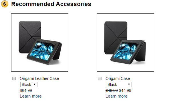
A well known trick shops and stores use is to use their bestsellers as an up sell to sell other products. The reason why this method is usually so successful is that it takes advantage of the fact that purchasing one item significantly increases the chance of purchasing another item. Offline stores might try to convince you to buy a beautiful case if you are already buying flowers. Your local car washer will offer to wax your car in addition to the regular wash. The brilliant way Amazon does this, is by using phrases such as” recommended accessories”, and “frequently bought together”, as well as “customers who bought this item also bought”.


Control your impulse!
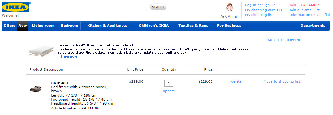
A similar upsell trick supermarkets use is to place impulse products in the checkout area. These are usually chocolate bars and sweets, and they can be very tempting, especially when there is a long line at the checkout. Ecommerce sites do this by offering you products when you are already on the checkout page. They use phrases such as, “You may also like…”, or, “Suggested Products”. In the following example from IKEA, I am already at the checkout, in the process of buying a bed, when I am offered to buy bed slats.
Are we mice in a maze?
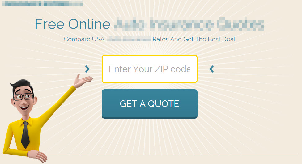
It has been shown in previous research, that when people walk into the mall, they will usually enter from the right side. Therefore, the most successful stores at the mall will often be on the right side of the main entrance. Similarly, stores will place their best looking and best smelling products on the right shelves. Supermarkets will place fruits and vegetables on the right, because they are colorful and fresh. Also, toiletry stores will place their best perfumes on the right. Off-line marketers know where people go, so they build their storage structure and selling tactics around this. In websites, there is no “right” to turn to, so you have the power to direct your users to the “right” place. Presenting your users with big bright call-to-action buttons helps direct them where you want them to go. Drawing attention to the buttons with arrows or other pointing visuals, will serve you even more, because the more attention you draw to your call-to-action, the more people will follow them. For example, this is a landing page we created, with all the visuals in the page pointing at the button.
Okay, but that’s my final offer!
If you start to walk away during a negotiation, the salesman you’re negotiating with, might be convinced he is about to lose you as a client. This may result in him pulling out an improved offer in order to close the sale. (Note – I’m not recommending that you walk away to get great offers, because it doesn’t always work.)
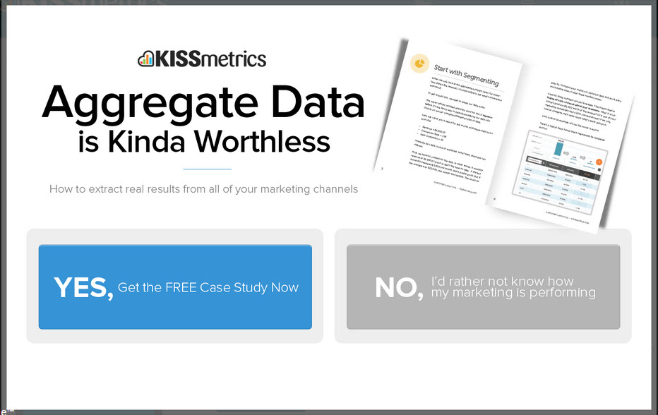
The same happens online, with the wonderful solution of exit intent pop-ups. These are offers you present to users who are about to leave your website. These offers may vary, depending on what you want to offer. E-commerce sites can offer discounts, while b2b can offer more information in the form of downloading data sheets. And bloggers can offer for visitors to sign up for a newsletter. The logic is to understand that you user is about to leave, and then to decide what the best offer is in order to keep him.
The following example is from Kissmetrics.
Mmm..shiny!
There are tons of other tricks you can take from the offline world and use them online. For example, wrapped items tend to look more prestige. So, in the online world, if you want to make your product look more prestige, you can place a virtual ribbon around it. You will see the use of words like pro, platinum or premium in the following example from Godaddy.

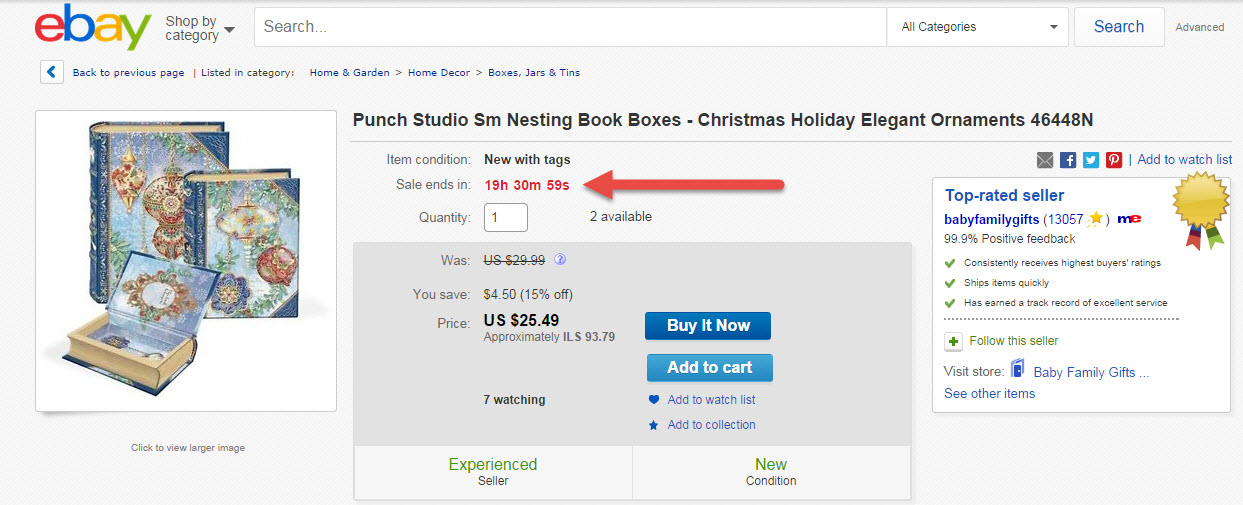
Another example is when stores give you samples in the hopes that you will like what you use. In your website, you can give free trials and hope people will like your product and will agree to pay for it next time. Supermarkets will sometimes give you time-limited coupons. Similarly online sales are sometimes time-limited as well, such as in the following example from eBay.
Next time you go shopping, look out for the tricks and manipulations the store is pulling to make you buy more. For example consider which products are at eye level and which products are more hidden? What music is the store playing in the background and how does it make you feel? Do you have anything in your shopping cart which you didn’t plan to buy before entering the store?
5 offline Tricks that will boost your online sales 5.00/5 (100.00%) 3 votes
Related Posts


5 offline Tricks that will boost your online sales
Have you ever visited a casino that actually had a clock hanging on the wall? Probably not. Have you ever wondered why the essential food in the supermarket is located in the very back, forcing you to walk all the way through the store? These are just two elementary offline tricks used to boost sales. The first one is so you will keep gambling without noticing what time it is, and the second one is meant to have you walk around the supermarket, in the hopes you will fill up your cart along the way, with items not on your shopping list. There are many more tricks that shops and stores use to make you buy more. Many of these tricks are also used in the online world, so it is important to learn about and understand them along with the logic behind them.
Wait! Do I really need that?
A well known trick shops and stores use is to use their bestsellers as an up sell to sell other products. The reason why this method is usually so successful is that it takes advantage of the fact that purchasing one item significantly increases the chance of purchasing another item. Offline stores might try to convince you to buy a beautiful case if you are already buying flowers. Your local car washer will offer to wax your car in addition to the regular wash. The brilliant way Amazon does this, is by using phrases such as” recommended accessories”, and “frequently bought together”, as well as “customers who bought this item also bought”.
Control your impulse!
A similar upsell trick supermarkets use is to place impulse products in the checkout area. These are usually chocolate bars and sweets, and they can be very tempting, especially when there is a long line at the checkout. Ecommerce sites do this by offering you products when you are already on the checkout page. They use phrases such as, “You may also like…”, or, “Suggested Products”. In the following example from IKEA, I am already at the checkout, in the process of buying a bed, when I am offered to buy bed slats.
Are we mice in a maze?
It has been shown in previous research, that when people walk into the mall, they will usually enter from the right side. Therefore, the most successful stores at the mall will often be on the right side of the main entrance. Similarly, stores will place their best looking and best smelling products on the right shelves. Supermarkets will place fruits and vegetables on the right, because they are colorful and fresh. Also, toiletry stores will place their best perfumes on the right. Off-line marketers know where people go, so they build their storage structure and selling tactics around this. In websites, there is no “right” to turn to, so you have the power to direct your users to the “right” place. Presenting your users with big bright call-to-action buttons helps direct them where you want them to go. Drawing attention to the buttons with arrows or other pointing visuals, will serve you even more, because the more attention you draw to your call-to-action, the more people will follow them. For example, this is a landing page we created, with all the visuals in the page pointing at the button.
Okay, but that’s my final offer!
If you start to walk away during a negotiation, the salesman you’re negotiating with, might be convinced he is about to lose you as a client. This may result in him pulling out an improved offer in order to close the sale. (Note – I’m not recommending that you walk away to get great offers, because it doesn’t always work.)
The same happens online, with the wonderful solution of exit intent pop-ups. These are offers you present to users who are about to leave your website. These offers may vary, depending on what you want to offer. E-commerce sites can offer discounts, while b2b can offer more information in the form of downloading data sheets. And bloggers can offer for visitors to sign up for a newsletter. The logic is to understand that you user is about to leave, and then to decide what the best offer is in order to keep him.
The following example is from Kissmetrics.
Mmm..shiny!
There are tons of other tricks you can take from the offline world and use them online. For example, wrapped items tend to look more prestige. So, in the online world, if you want to make your product look more prestige, you can place a virtual ribbon around it. You will see the use of words like pro, platinum or premium in the following example from Godaddy.
Another example is when stores give you samples in the hopes that you will like what you use. In your website, you can give free trials and hope people will like your product and will agree to pay for it next time. Supermarkets will sometimes give you time-limited coupons. Similarly online sales are sometimes time-limited as well, such as in the following example from eBay.
Next time you go shopping, look out for the tricks and manipulations the store is pulling to make you buy more. For example consider which products are at eye level and which products are more hidden? What music is the store playing in the background and how does it make you feel? Do you have anything in your shopping cart which you didn’t plan to buy before entering the store?
Related Posts
Tags: