Heatmaps are a fantastic way to understand user behavior on your landing pages. By recording your landing pages you can understand many important metrics about your audience and most importantly your page performance.
Many times relaying on your google analytics data only can be like receiving a 2 dimensional image of reality, completely missing the real clicks and hidden potential of your users behavior.
There are many tools that allow tracking of conversions, user behavior and landing page performance. Most tools are quite good but the real challenge is understanding how to read them correctly and deciding what to do next.
Here are 4 ways to understand your landing page performance using heatmaps:
Reading the Heatmap
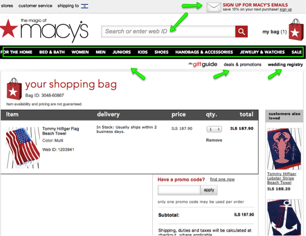
- Escape routes – One of the most important tips we give ecommerce stores is always – lose the external links, this is true not only for ecommerce stores but for all landing pages. Making sure your audience is taking the action you want it to, is extremely important. If you’re aiming for signups or downloads, you want to make sure your users are actually doing so and not checking out the “services” instead, or the blog. The heatmap shows you what people are looking at, where their attention is, and if it’s not on the Call To Action, your doing something wrong. Many times you’ll see people are checking out unnecessary stuff that will allow you to either hide it or remove it. In macy’s case below, removing all external links will allow for smoother shopping experience.

Note two things about the Macy shopping cart:
- Dozens of escape routs just begging the customer to abandon the shopping cart.
- The call to action “Pay” is below the fold and cannot be seen unless you scroll.
- There are several offers on the checkout page, allowing the user to “wonder” around on the site instead of ordering now.
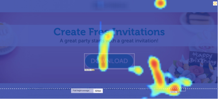
- What counts – As we’ve said before, what really counts is what your audience wants. By adding a simple heatmap to your landing page you could learn what your audience is looking for, what your product lacks and how to fix it. In this example below for instance we found that many of our client’s traffic was clicking on the “read more” button (right bottom corner) instead of the actual download button. Understanding this gave us two leverages:
- We understood users needed more information
- We added a download button in the “learn more” section and increased downloads even more.

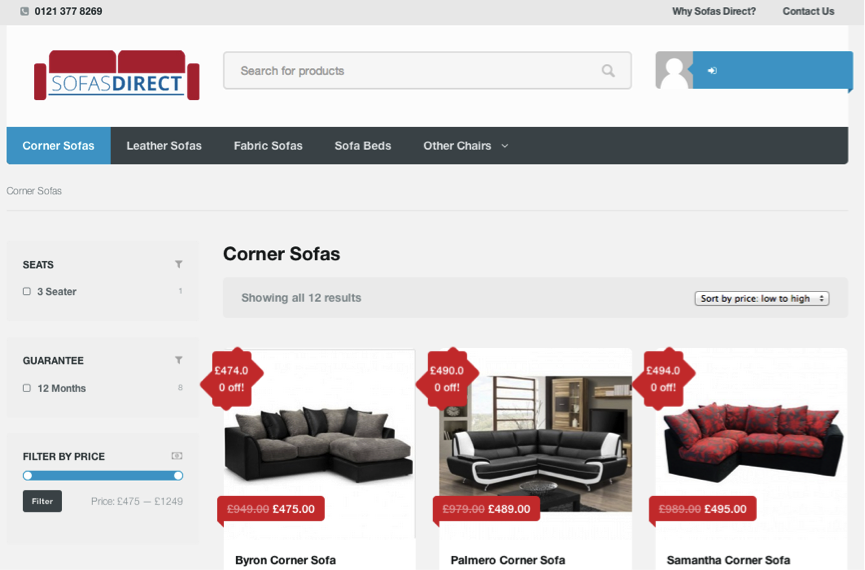
- The Real Fold – The term “above the fold” was actually coined in the offline world and refers to the part of the screen your users see when they first land on your landing page. It’s common and important to place all call to action buttons and important messaging in that part of the page, so to make sure everyone sees them. As oppose to this furniture company that forces you to scroll to find the “purchase” button.

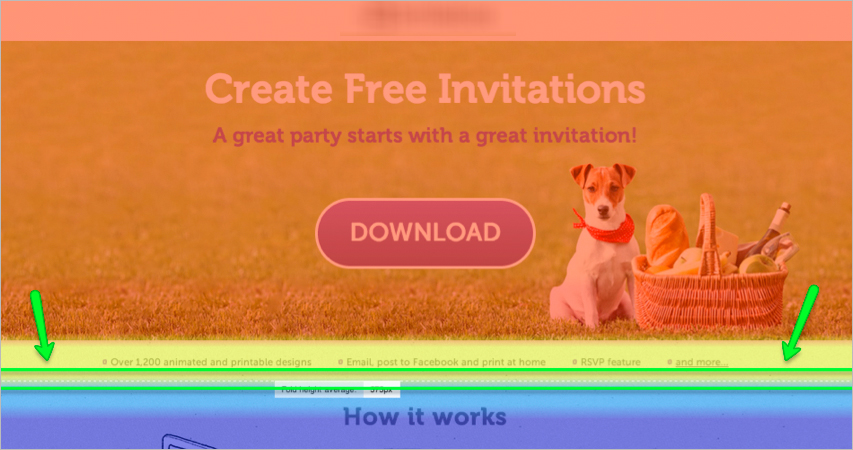
Using a heatmap can show you what the average user sees and where their fold is. Notice the doted line that appears below on our screenshot, that’s the average fold meaning anything important should go above that line.
- Important note: these days there are large variety of screen resolutions which result in multiple “above the fold’ locations, therefore guessing the location of the fold can lead to poor performance. The use of tools like clicktale’s scroll map can point out the actual average fold and the amount of your users who actually see your call to action or scroll down to view the lower part of your page.

- What people are clicking on – The click map can show you what people are clicking on. Many times you’ll be surprised to find out that some icons or even words seem like buttons to people and they try clicking on them. Similar to understanding what interests your users, the clicking map can help figure out what confuses your users, or drives un-needed clicks. For example, the most common clicks you see are clicks on logos. This usually happens when companies mention others as their clients/partners and add their logos to the landing page. This also happens when you place your logo in a dominant place on the landing page, suddenly everyone’s clicking on it. Although this isn’t an external link (hopefully) and it isn’t sending people out of your landing page but it’s still distracting and confusing and needs dealing with.
Heatmaps are just one of the ways to navigate your way throughout the guesswork that conversion optimization can be. Analyzing the right data, seeing user’s behavior and understanding what’s behind it can help tremendously in establishing your conversion optimization strategy. The key to using these tools correctly is being able to analyze them and see what your next step is.
We’d love to hear from your experience, have you used heatmaps before, and have you learned anything interesting from them?
4 Ways To Optimize Landing Page Performance Using Heatmaps 5.00/5 (100.00%) 5 votes
Related Posts


4 Ways To Optimize Landing Page Performance Using Heatmaps
Heatmaps are a fantastic way to understand user behavior on your landing pages. By recording your landing pages you can understand many important metrics about your audience and most importantly your page performance.
Many times relaying on your google analytics data only can be like receiving a 2 dimensional image of reality, completely missing the real clicks and hidden potential of your users behavior.
There are many tools that allow tracking of conversions, user behavior and landing page performance. Most tools are quite good but the real challenge is understanding how to read them correctly and deciding what to do next.
Here are 4 ways to understand your landing page performance using heatmaps:
Reading the Heatmap
Note two things about the Macy shopping cart:
Using a heatmap can show you what the average user sees and where their fold is. Notice the doted line that appears below on our screenshot, that’s the average fold meaning anything important should go above that line.
Heatmaps are just one of the ways to navigate your way throughout the guesswork that conversion optimization can be. Analyzing the right data, seeing user’s behavior and understanding what’s behind it can help tremendously in establishing your conversion optimization strategy. The key to using these tools correctly is being able to analyze them and see what your next step is.
We’d love to hear from your experience, have you used heatmaps before, and have you learned anything interesting from them?
Related Posts
Tags: