Emotional conversion optimization is about recognizing users emotions & personalities and using them to trigger action quicker and more effectively.
This post will give you a few do’s and don’ts regarding your pricing pages and how to increase their revenue. The most important thing to remember is that the more you know about your users, the better you can convert them.
Don’t
Compare your prices to your competitors.
Many brands attempt to show their product as cheaper than their competitor. Most users aren’t looking for cheap. Pricing is important but value is much more.
Consider your users, and ask yourself:
- What is your value? What is your user gaining from purchasing your service/product?
Emphasizing price over real value could be a mistake. Research has shown that expressing your value is far more converting than price comparing. Make sure you know what your customers are looking for in your pricing page as 99% of the time it isn’t just the price but what the actual value.
Do:
Use emotional icons and features to highlight the pricing plan you wish to promote.
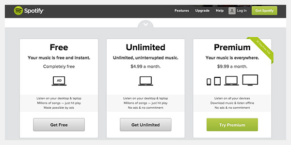
In many cases we see 3 pricing plans, with one pricing plan more dominant than the other, usually using a ribbon or banner. For example:
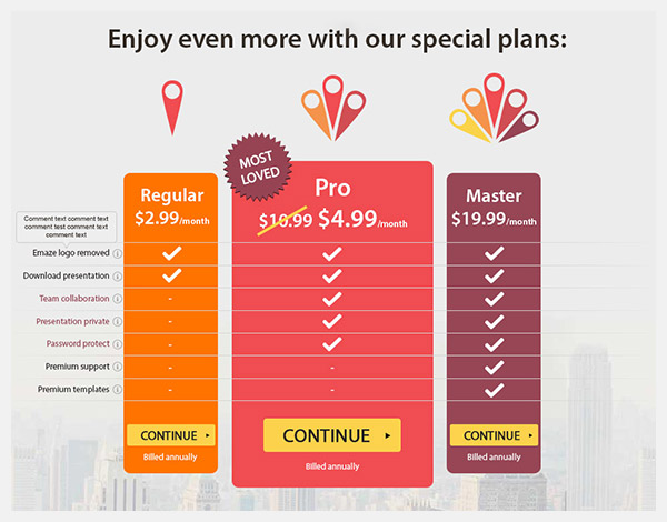
Try using more personalized highlighting options that will explain why you recommend the specific pricing plan, for example: Using our client’s logo we were able to emphasize the difference between each pricing plan and by using the “most loved” badge we explained why the middle plan is emphasized.
Don’t:
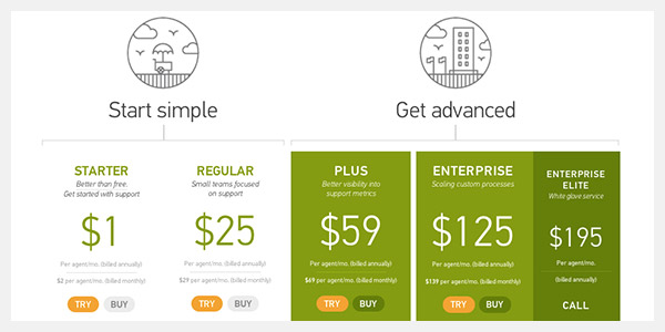
This is actually a double “don’t”:
To increase conversion to purchase, you want to make things clear and reduce the possibility of abandonment as much as possible, with so many options and buttons, how will the user know which one is best for them? Example:
Do:
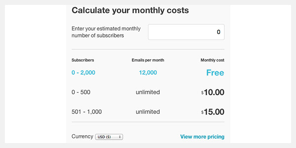
Personalize your pricing plans as much as possible. I love using mailchimp as the perfect example of exactly that. By giving people the option to insert their monthly capacity, mailchimp delivers a “personalized” pricing plan that fits your needs. *Bonus- note the option to change currencies – another great personalization feature.
Like always, the best thing you can do is test your pricing pages. Upload two versions of your pricing pages and test a single theory. Get a few more tips and ideas on how optimize your landing pages and pricing pages here.
4 Simple Tips To Get Your Pricing Pages Selling 5.00/5 (100.00%) 5 votes
Related Posts


4 Simple Tips To Get Your Pricing Pages Selling
Emotional conversion optimization is about recognizing users emotions & personalities and using them to trigger action quicker and more effectively.
This post will give you a few do’s and don’ts regarding your pricing pages and how to increase their revenue. The most important thing to remember is that the more you know about your users, the better you can convert them.
Don’t
Compare your prices to your competitors.
Many brands attempt to show their product as cheaper than their competitor. Most users aren’t looking for cheap. Pricing is important but value is much more.
Consider your users, and ask yourself:
Emphasizing price over real value could be a mistake. Research has shown that expressing your value is far more converting than price comparing. Make sure you know what your customers are looking for in your pricing page as 99% of the time it isn’t just the price but what the actual value.
Do:
Use emotional icons and features to highlight the pricing plan you wish to promote.
In many cases we see 3 pricing plans, with one pricing plan more dominant than the other, usually using a ribbon or banner. For example:
Try using more personalized highlighting options that will explain why you recommend the specific pricing plan, for example: Using our client’s logo we were able to emphasize the difference between each pricing plan and by using the “most loved” badge we explained why the middle plan is emphasized.
Don’t:
This is actually a double “don’t”:
To increase conversion to purchase, you want to make things clear and reduce the possibility of abandonment as much as possible, with so many options and buttons, how will the user know which one is best for them? Example:
Do:
Personalize your pricing plans as much as possible. I love using mailchimp as the perfect example of exactly that. By giving people the option to insert their monthly capacity, mailchimp delivers a “personalized” pricing plan that fits your needs. *Bonus- note the option to change currencies – another great personalization feature.
Like always, the best thing you can do is test your pricing pages. Upload two versions of your pricing pages and test a single theory. Get a few more tips and ideas on how optimize your landing pages and pricing pages here.
Related Posts