4 Meaningful Landing Page AB Test Ideas to Run Today
I recently got back from speaking at Optimizely’s event Opticon in San Francisco which had some really interesting and valuable content going on and some really cool speakers (not referring to myself!). One thing that kept coming up on all sessions and appeared to be on everyone’s agenda was how to get ideas for tests. It seems that many companies now have great techniques for prioritizing their tests and for launching them, but not many know what to actually test. Once you’ve done all the research and found the right pain point to attack, you need to start planning what you’re actually going to change in the funnel and how will you measure its success.
Running another call to action button test is pointless as you’ve probably realized by now the results aren’t that interesting and hard to analyze. So what should you test?
Below is a list of 4 meaningful ab test ideas you can run on your landing pages and actually learn from.
1. Test image strategies: As 60% of our brain is geared towards visual context, the first thing we see on a landing page is the visual and according to the picture superiority effect, images are better remembered than words. The visual you use on your landing page will have a major impact on your visitor’s decision to stay or leave. One interesting test to run is visual strategy – test an “end result” image versus a “this is the product image”. While the majority of business have an image of their product on the landing page, the end result image will demonstrate the emotion and status a customer will feel once they’ve purchased your solution.
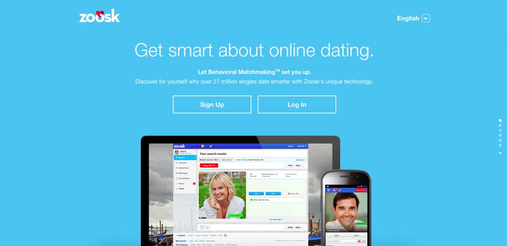
For instance on the latest webinar I did with Unbounce I compared landing pages of dating sites, on one hand you have Zoosk, showing their product on their landing page:
On the other, you have this dating site showing you the end result of using their product – a happy couple on the beach (why we designed the page this way).

To run an image strategy test, start by asking yourself – what do people want to feel once they’ve purchased our solution? how do we make their life better? then, project that with your image.
2. Test an exit pop – Your personal feelings about them don’t matter – exit pops (done the right way) work.
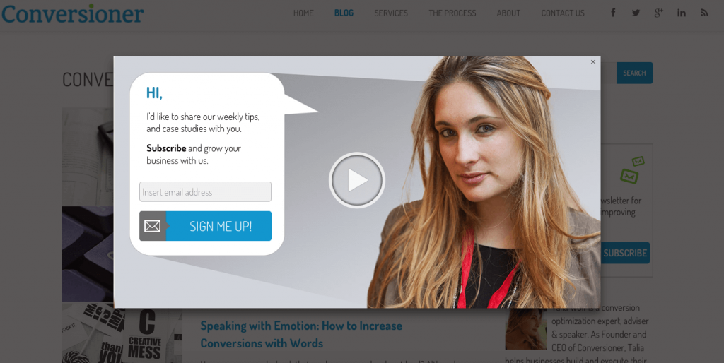
A while ago we added a newsletter signup pop up to the Conversioner site.
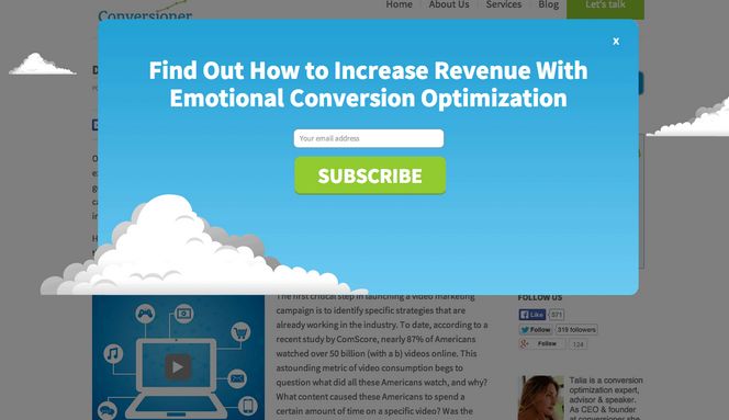
It was actually doing well, but our marketing team came up with the idea to put my picture on one of the pop ups and a video of me inviting readers to join our community. Needless to say, I was completely against it. I was not interested in having my face all over the website. But once the AB test card was pulled, I couldn’t continue arguing… To my dismay, the pop up tripled our newsletter registrations and we were now getting almost three times as much signups a day. I still dislike that pop up, but it still works better than anything else. Proving once again, that opinions don’t matter and what matters are the results.
A clean, intuitive and simple pop up can work magic, go test it.
3. Test Headline Strategies – I’ve probably said this countless times before; customers do not care about your achievements or your success, we care about what’s in it for us. This is where you take a step back and consider the value your customer receives by purchasing your solution. Most companies highlight their features: the characteristic of your solution that remain the same whether your customer buys it or not. Rather than the value, which is the outcome perceived and defined by your customer that will make a change in their life if they purchase your product or not.
To highlight the value focus on the emotional gain for the customer- a better version of themselves. Essentially this means highlighting how your customer’s life will change by purchasing your solution. Test one variation that highlights that value.
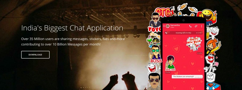
Hike’s strategy is highlighting their size and capacity. Focusing on themselves as the largest chat application. To optimize this, they could explain why they’re the largest – showing the value customers see in using their app.
And here are a couple of landing pages that highlight your value as a customer:

Do promises better more productive meetings that will make you smile.

Wunderlist highlights the change you’ll see in your life.
Consider testing these different strategies- about the product vs. the outcome for your customer.
4. Test dedicated mobile landing pages – Mobile isn’t the next big thing, it already is. As you know, responsive design is better than having to pinch & zoom, but it takes a lot more than that to convert people on mobile. Test a dedicated mobile landing page and make sure you treat your mobile visitors properly:
- Short messages
- Large call to action button
- Utilize mobile capabilities like the “click to call” button and navigation or location based offers.
Mobile visitors have different expectations (60% of web users expect a site to load on their mobile phone in 3 secs or less), don’t let them down because they won’t return.
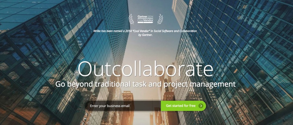
Let’s see what Wrike’s responsive design looks like (the desktop version):
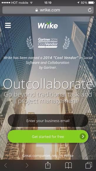
The mobile responsive version (compressing all desktop data to a mobile screen):
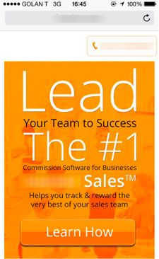
On the over hand this company has a desktop version for their landing page and a different mobile version for it:

Do you have any recommendations for quick meaningful test people could run?


Pingback: 4 advertising strategies to Make shoppers Love Your model | IoEBusiness.com | IoE Internet of Everything Business()