
Your website’s landing page is the first page a potential customer sees when they get to your website – it’s like being introduced to someone for the first time. First impressions count. If your website makes a bad first impression (we’ve all met people who have wet fish handshakes, intolerably bad breath or greet our chests instead of our eyes), you’ll lose customers. It’s as simple as that. Which is why, this post will be about landing page optimisation, everything you need to optimise your landing page and keep your customers.
Where to Start – Tracking
Knowing where to start landing page optimisation is as important as knowing what to optimise. There a 3 interesting metrics you should check before starting out:
First, you’ve got to look at how your landing page is handled by different technology. Mobile devices and tablets display information in different ways to a laptop screen, and because you want to have a concise, clear and effective presence at all times, you’re going to have to work out how your information is best displayed across all devices. Further more, this metric will show you where to start optimising, which traffic is perfoming better or worst than others and give you an indication as to what needs fixing. This metric will most probably signal you need a specific mobile landing page design (or website) in addition to your main site.
Then, you should review all your pages’ conversion rates. Which pages do people click away from, and which pages keep people on your site and moving towards buying your product or service? (Hint: If your landing page has a high exit rate, you’ve got a problem) Tracking the movements of new and returning customers allows you to figure out where you can make the most impact.
Finally, you’ve got to ask how people are getting to your website in the first place (these are referred to as your marketing channels). There are many platforms that present viable channels for traffic to your site (social media, email newsletters, direct advertising etc. etc.), but you don’t want to be wasting time using those that don’t actually repay you for the time and money involved in using them.
Implicit in the type of research mentioned above is a clearly defined set of business and user goals for your website to achieve. If content on your site isn’t supporting your business goals and giving customers the information they need, you need to rethink your content strategy and your website design. For instance, if getting people to sign up to your newsletter is important, yet you have a signup form with fifteen fields and a murderously difficult interface, and your landing page doesn’t allow easy access to the form in the first place, you’re shooting yourself in the foot.
Developing a Landing Page Optimisation Strategy
Start by understanding that your business (and therefore your website) caters not to the whole world, but to a certain demographic. Your customers conform to one or more ‘personas’, i.e. a group of people with similar interests, emotional triggers, motivation and goals. Consider that a man who wants to buy a the latest Porsche is unlikely to stay long on a car dealers website if it looks and feels like they’re trying to sell him a camper van. When customers arrive on your landing page, consider what their passion is and what customers want to feel like once they’ve purchased your product or service, then show it on the landing page. See how emotional triggeres increased conversions by 78% in the first round.
Once you’ve started understanding the emotional triggers you want to convey on your landing page, consider the following elements:
The colour you use on your landing page has a huge impact on emotions and action. Reds and pinks convey passion and energy while oranges create an uplifting optimism; blues engender trust, authority and intelligence, while purples indicate a creative spirituality. Getting the right mix of colours to compliment your central message and the theme of your content is vital.
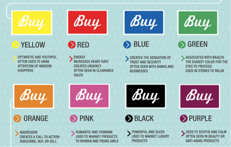
Kissmetrics
Perhaps even more important than colour is the flow of information on the landing page. Too much badly organised information turns people off quicker than a power failure. Try and give people nothing but the information they need to take the next step you want them to take in their interaction with you – or better yet, try to think of your interaction as a conversation. No one likes to be shouted at, so be clear, precise and intelligent, and organise properly.
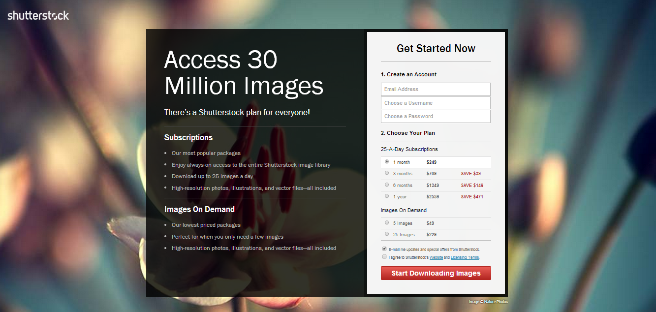
Shutterstock uses the title: Access 30 million images on their landing page. Mainly focusing on the features and pricing of Shutterstock and refraining for giving an emotional value.
Manpacks on the other hand could have written: “Millions of products for men” but instead put an emphasis on the change in life and morning rituals customers achieve = a real value.

Your landing page should also contain a simple, effective and easy to see Call to Action with an appropriate link or button. This motivates people to get further involved with your business. Your CTA should also include a powerful message that rather than focussing on the product or service you offer, puts the customer first (part of putting the customer first is also ensuring you include the appropriate trust elements that prove you’re not going to steal your customers money and identity).
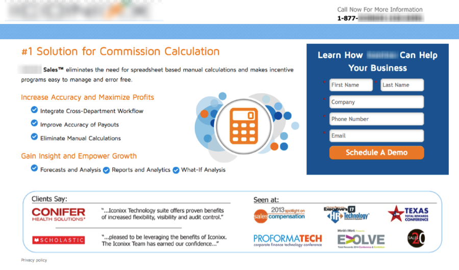
In the landing page below you notice the messaging of the landing page and the call to action is about the company’s success. In the variation we created at conversioner we focused on what the customer want’s to achieve: Lead their team to success.

Finally in landing page optimisation test your landing page against differently designed alternative landing pages (A/B testing) to see which one has a higher conversion rate. Remember, test strategies, not elements.
Getting Started with Landing Page Optimisation 4.71/5 (94.29%) 7 votes
Related Posts


Getting Started with Landing Page Optimisation
Your website’s landing page is the first page a potential customer sees when they get to your website – it’s like being introduced to someone for the first time. First impressions count. If your website makes a bad first impression (we’ve all met people who have wet fish handshakes, intolerably bad breath or greet our chests instead of our eyes), you’ll lose customers. It’s as simple as that. Which is why, this post will be about landing page optimisation, everything you need to optimise your landing page and keep your customers.
Where to Start – Tracking
Knowing where to start landing page optimisation is as important as knowing what to optimise. There a 3 interesting metrics you should check before starting out:
First, you’ve got to look at how your landing page is handled by different technology. Mobile devices and tablets display information in different ways to a laptop screen, and because you want to have a concise, clear and effective presence at all times, you’re going to have to work out how your information is best displayed across all devices. Further more, this metric will show you where to start optimising, which traffic is perfoming better or worst than others and give you an indication as to what needs fixing. This metric will most probably signal you need a specific mobile landing page design (or website) in addition to your main site.
Then, you should review all your pages’ conversion rates. Which pages do people click away from, and which pages keep people on your site and moving towards buying your product or service? (Hint: If your landing page has a high exit rate, you’ve got a problem) Tracking the movements of new and returning customers allows you to figure out where you can make the most impact.
Finally, you’ve got to ask how people are getting to your website in the first place (these are referred to as your marketing channels). There are many platforms that present viable channels for traffic to your site (social media, email newsletters, direct advertising etc. etc.), but you don’t want to be wasting time using those that don’t actually repay you for the time and money involved in using them.
Implicit in the type of research mentioned above is a clearly defined set of business and user goals for your website to achieve. If content on your site isn’t supporting your business goals and giving customers the information they need, you need to rethink your content strategy and your website design. For instance, if getting people to sign up to your newsletter is important, yet you have a signup form with fifteen fields and a murderously difficult interface, and your landing page doesn’t allow easy access to the form in the first place, you’re shooting yourself in the foot.
Developing a Landing Page Optimisation Strategy
Start by understanding that your business (and therefore your website) caters not to the whole world, but to a certain demographic. Your customers conform to one or more ‘personas’, i.e. a group of people with similar interests, emotional triggers, motivation and goals. Consider that a man who wants to buy a the latest Porsche is unlikely to stay long on a car dealers website if it looks and feels like they’re trying to sell him a camper van. When customers arrive on your landing page, consider what their passion is and what customers want to feel like once they’ve purchased your product or service, then show it on the landing page. See how emotional triggeres increased conversions by 78% in the first round.
Once you’ve started understanding the emotional triggers you want to convey on your landing page, consider the following elements:
The colour you use on your landing page has a huge impact on emotions and action. Reds and pinks convey passion and energy while oranges create an uplifting optimism; blues engender trust, authority and intelligence, while purples indicate a creative spirituality. Getting the right mix of colours to compliment your central message and the theme of your content is vital.
Kissmetrics
Perhaps even more important than colour is the flow of information on the landing page. Too much badly organised information turns people off quicker than a power failure. Try and give people nothing but the information they need to take the next step you want them to take in their interaction with you – or better yet, try to think of your interaction as a conversation. No one likes to be shouted at, so be clear, precise and intelligent, and organise properly.
Shutterstock uses the title: Access 30 million images on their landing page. Mainly focusing on the features and pricing of Shutterstock and refraining for giving an emotional value.
Manpacks on the other hand could have written: “Millions of products for men” but instead put an emphasis on the change in life and morning rituals customers achieve = a real value.
Your landing page should also contain a simple, effective and easy to see Call to Action with an appropriate link or button. This motivates people to get further involved with your business. Your CTA should also include a powerful message that rather than focussing on the product or service you offer, puts the customer first (part of putting the customer first is also ensuring you include the appropriate trust elements that prove you’re not going to steal your customers money and identity).
In the landing page below you notice the messaging of the landing page and the call to action is about the company’s success. In the variation we created at conversioner we focused on what the customer want’s to achieve: Lead their team to success.
Finally in landing page optimisation test your landing page against differently designed alternative landing pages (A/B testing) to see which one has a higher conversion rate. Remember, test strategies, not elements.
Related Posts
Tags: