11 steps for creating the best converting registration forms
Statistics on registration forms are pretty grim: 86% (!) of users leave a page instantly when they’re required to fill out a form.
Thanks to hundreds of lead generation/signups tests we’ve done in the past 4 years, we’ve come up with various tips and tricks that can help reduce abandonment rate significantly and improve the quality of leads dramatically.
How to create converting registration forms:
- Auto fill – Don’t waste your user’s time and energy. Use auto complete to detect the their full name, address and email address. The less you ask of a user the more inclined they will be to fill in the form.
- Minimize your requests – Remove all the unnecessary fields, they can complete them later on. Ask only for the most basic information and create a quicker process for the user. Give the user the feeling that your form is a 30 second fill out and no more.
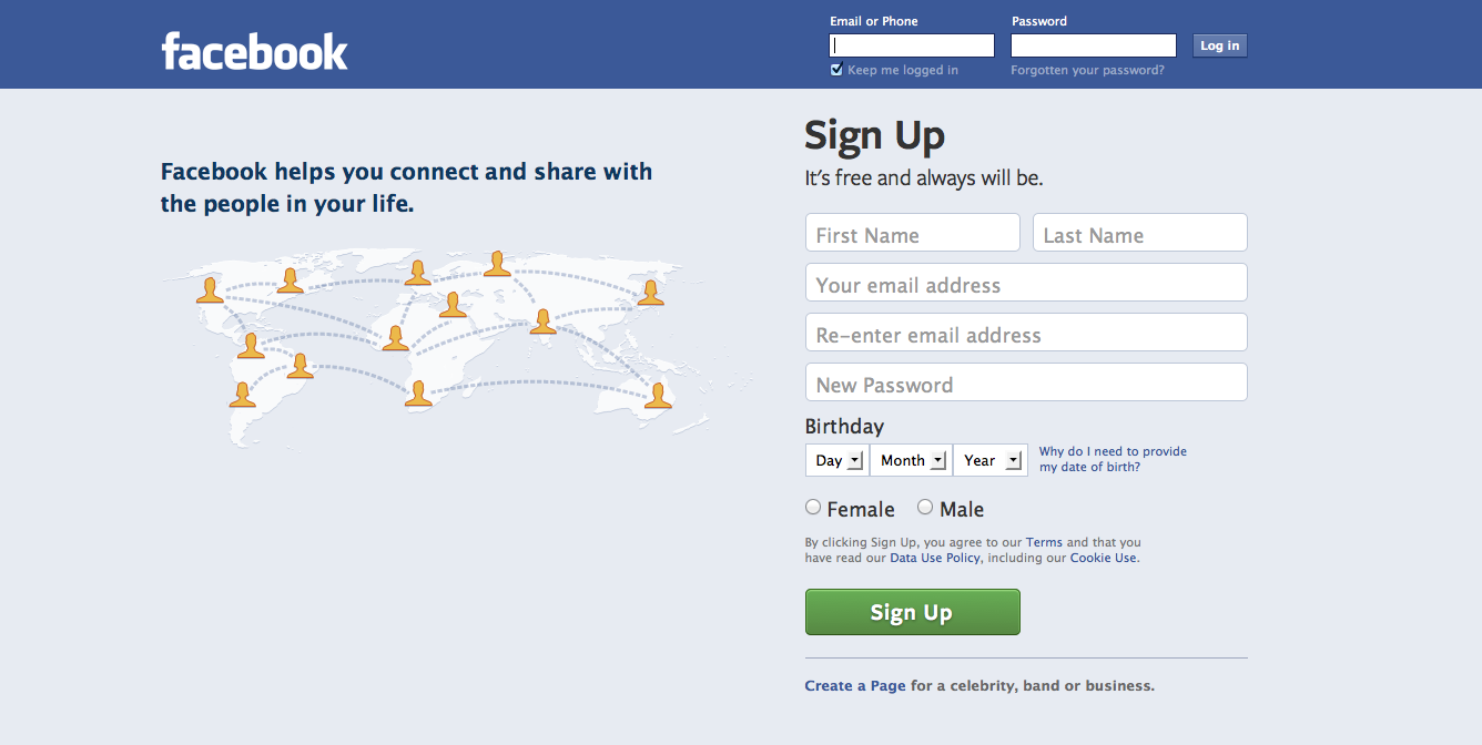
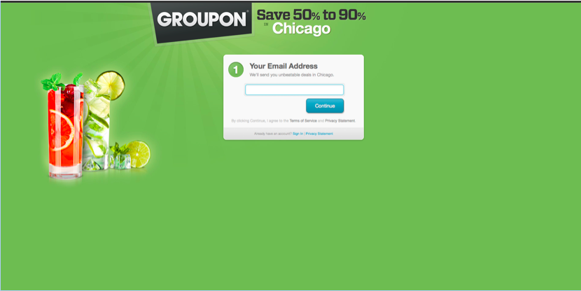
Facebook’s signup process: To make things simpler, facebook could create one field for first & last name and make it look shorter. They could also have just one field for the email address and only after the user clicks “Sign up” show a message that says: “we’re sending you an email, make sure your the address is correct.” Groupon does it in an great way, asking one short question at a time and slowly navigating the user towards the end.
- Help the user – Add small question marks next to your fields including explanations of each field. You’d be surprised to learn the kind of questions that prevent users from filling out a form, things that might seems obvious to you, but aren’t clear to others.
- Messaging – Be specific, use a title that explains exactly why the user needs to sign up, for example: Signup to get a free e-book!
- Call to action – Don’t forget to end your form with a clear call to action that indicates the end of the form and the continuation of the next steps.
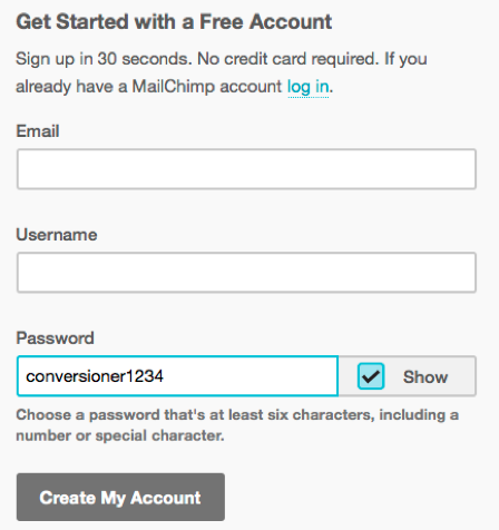
- “Show password” – Instead of asking your user to fill in their new password twice for validation, give them the option to “show password” and go over it by themselves. This will reduce the amount of fields and will give a sense of an easy and quick form.By giving users the option to “show” the password, mailchimp reduces the sign up fields to the minimum required and still allows users to verify their email.

- Social sign up – Make it quick and easy, allow users to sign up or log in via their Facebook, Twitter or Linkedin account.
- Mobile forms: One of the most important parts of filling out a form on mobile is to be able to see what you are actually doing, Don’t forget to zoom in on each field the user is updating. Another tip is to enable only the relevant keyboards in each field – i.e in the phone field to create the numbers as the default keyboard.
- Mobility- some users like to use their mobile horizontally and some vertically, don’t forget to make your mobile forms accessible on both screen options and allow for easy usage.
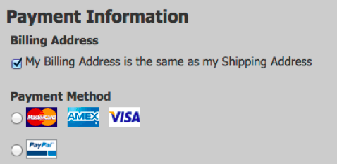
- Shipping and billing – Allow users to simply auto-fill their payment address from the shipping address instead of filling in their details twice.

- Make required/optional fields clear to the user – If some info isn’t required, we advise you remove it completely. If you still want to keep it in the form make sure it is clear to users what’s mandatory and what’s not.
- Clear errors – Errors a very important aspect of filling out forms. Locating the errors on the bottom or hidden will make it difficult for a user to understand why they can’t submit the form.
Filling out a form should be a simple step along the funnel. Make sure to test your registration forms as much as possible and of course, learn from your insights. If you want to get some more information, contact us here.


Pingback: AB Test Checklist: - Conversioner()
Pingback: The Ultimate List Of AB Testing()
Pingback: Practical Tools to Improve Web Forms()
Pingback: The A/B test checklist | Bobbie Hollowell Blog()
Pingback: The A/B test checklist | TechDiem.com()
Pingback: AB測試清單:著手前需要核對的所有事()