Optimize your landing pages with these 3 emotional triggers
Conversion optimization can be roughly divided in to two methods: Behavioral Targeting and Emotional Targeting.
Behavioral targeting is about segmenting users according to their geographical location, their gender, age and footprints they leave online (their likes on Facebook for example).
Emotional targeting is a new targeting method we developed in the past 4 years in which we essentially study how and why people make decisions. We focus on the user’s first impression; feelings and emotional triggers and then optimize any landing page needed and improve ROI.
In short, within 2.8 seconds on your landing page a user will decide if they’re going to buy your product or not. Emotional targeting focuses on making sure the user decides to buy.
Here are 3 examples of emotional triggers to improve your landing page conversion: 
Emotional Trigger: Salvation Syndrome
Our brains are better equipped to remember simple choices. When there are too many options on a single landing page, it is difficult to focus on one particular message. This is why we make the decision for our users.
Make the choices for your users:
- Using terms such as ‘Most Popular’ or ‘Start Out With, “Best Value” simplifies the decision for the consumer.
- Removing unnecessary links, buttons and offers – Your user needs one thing, tell them what it is.
- Highlight the most important parts of your landing page so they focus on what you want them to do.
- Instruct your users on what to do – Notice how the words “Click HERE” are the most linked words on the Internet, telling the user what to do.
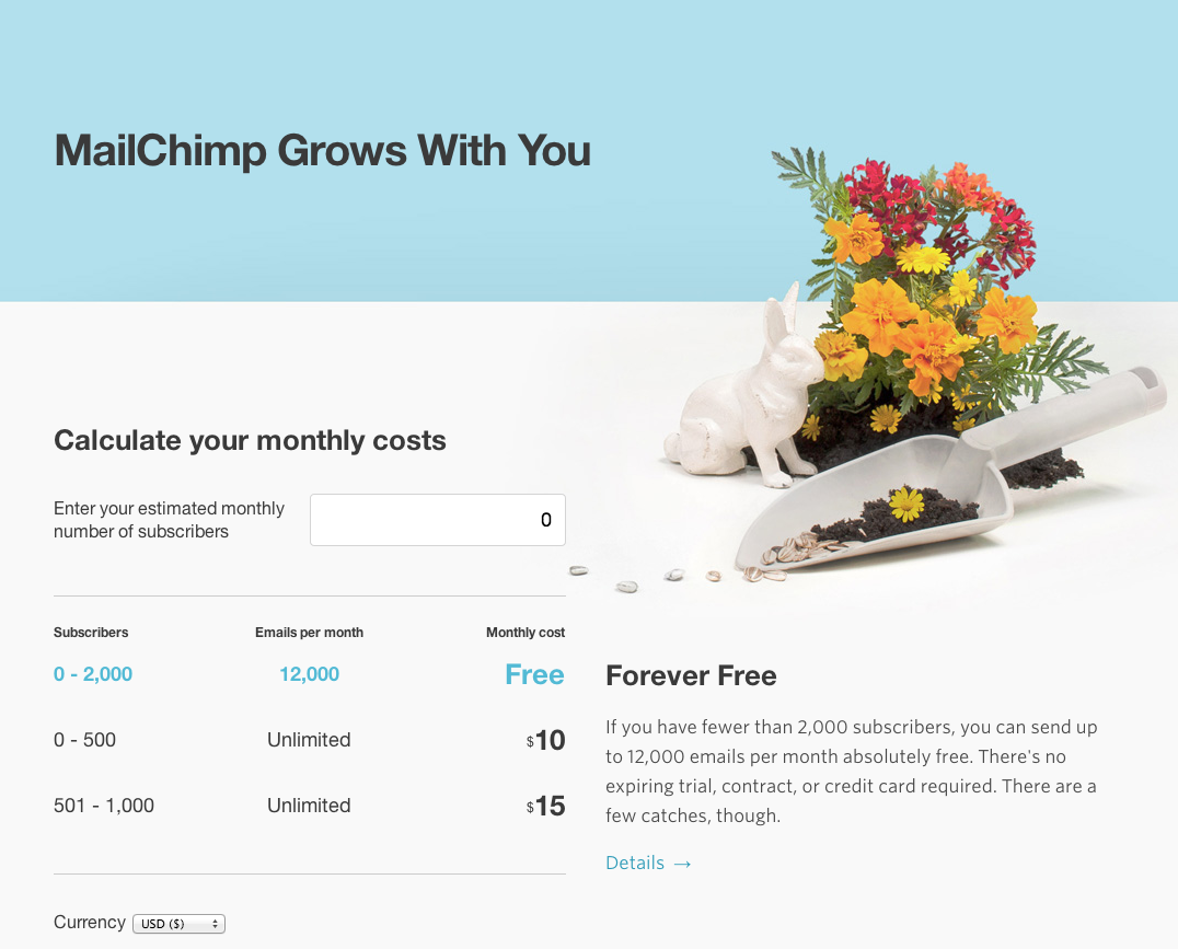
I love MailChimp’s pricing page: The first thing it does, is make you feel the pricing is according to YOUR need. It’s personal and it saves me from worrying if I’m choosing the right plan.
Mailchimp’s pricing page
Emotional Trigger: Reassurance and Reachability
In general people want to feel the world is it at their fingertips and that all they have to do is reach out and grab what they want – easily and securely. The key to this is making the user feel safe and most importantly, making the user feel that your product is easy and reachable. Start by thinking about the barriers users could experience by using your product:
- Is it expensive?
- Is it hard to use?
Once you understand the barriers, it’s easier to address their concerns and dismiss them with information and examples.
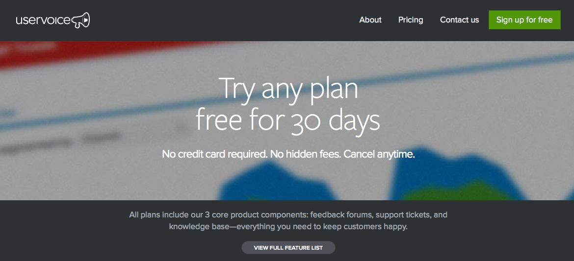
A great example for reachability and reassurance is UserVoice’s price plan, first your told to “calm down” and only then can you see the prices:
- All plans are 30 days free
- You can cancel at anytime
- Most importantly – No credit card required
Uservoice’s pricing page
Emotional Trigger: 1 in a million syndrom
Here’s the thing, people constantly compare themselves to others. We may not admit it, but we all want to feel special and unique. Adding simple social tools to your product could help the user not only feel unique but can also make them your ambassador. Adding levels of achievement to your product, badges, points and even a funny sentence could make a world of difference.
My two favorite examples are Timehop and Gettaxi.
Timehop has a way of writing that simply makes me want to share every line they write.
Timehop App
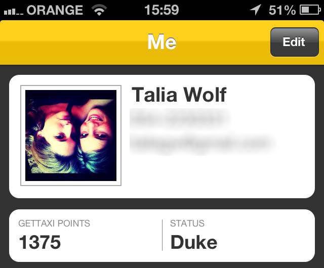
Gettaxi on the other hand have a simple status feature that updates every few rides and tells you how awesome you are.
GetTaxi App
These are all great approaches that make products viral and most importantly – make the user feel special and unique.
The main thing to understand about emotional targeting is that by researching your audience and understanding its emotional triggers you can find millions of ways in targeting them and getting them into action.
It is all about understanding the individual user and using emotional messages to help make their decision.



Pingback: 4 SIMPLE TIPS TO GET YOUR PRICING PAGES SELLING | GeekTime()
Pingback: The emotional trigger that works every time and improves conversion dramatically | GeekTime()