The call to action button is one of the most important elements of your conversion optimization funnel. Designing high converting call to action buttons requires planning; In this post we’ll cover important information about CTA buttons, check out different landing pages and their call to action buttons & learn how to optimize them for better conversion on websites, emails and blogs.
The CTA Button
 The call-to-action (CTA button) is an element that most commonly appears as a button or a link prompting visitors into taking a certain action. A CTA button can be anything from a ‘subscribe’ button trying to get people to sign up to a service or blog to a ‘purchase’ button getting people to complete their purchase or pay for a service. There are 3 key elements you should follow regarding your call to action buttons:
- Attention
- Messaging
- Strategy
These 3 key elements have a large impact on a CTA’s conversion rate and can make a world of difference by simply optimizing them:
Attention
Creating effective call to action buttons leads to higher conversions, the first part you want to address will be the attention the call to action buttons grab. A call to action button has to stand out and be the first natural place a visitor turns to. By making sure your call to action button is attention grabbing you’re making sure more people click on it. That being said, you do not want to exaggerate or overwhelm your visitors with a huge button, there are additional ways other than size that can grab your visitors attention:
Size
Size does matter. Compared to other elements on the page you want to make sure your CTA button stands out. The size of an element on your landing page will indicate it’s importance so make sure it is larger than any other buttons or links. This tip applies not only for landing pages but checkout processes too, the call to action has to be more dominant than other links or buttons and if possible, all others should be removed.
Color
The color of a button has a huge effect on its conversion. Other than the psychological effect colors have on purchasing habits, colors are a great way to make your call to action button stand out and be more prominent. Use highly contrasting colors for your CTA relevant to the elements on your landing page. Place your call to action on a background that helps bring out the CTA and doesn’t swallow it. Charity:Water has a great landing page that uses both a highly contrasted button color – blue on a green background and uses the image of the girl to direct attention to it. The use of this specific image is very interesting, it would be interesting to test different emotional triggers on this type of landing page.

Image
The image of your landing page takes the biggest part in your CTA’s attention. Other than making sure that your image isn’t grabbing all the attention from your button, the image can be a huge help and indicator for your users. Our brains process images 60,000 times quicker than text, meaning the image you have on your page will have a crucial roll in pointing people in he right direction. Make sure all your elements and images are complementing the call to action button and in some case even pointing at it. This landing page has 3 important elements emphasising its CTA:
- The size of the button – making sure the CTA is the most dominant on the page
- The Image clearly points to the CTA
- The color is dominant and noticeable
 An image doesn’t necessarily have to point to an image but it should be connected to it in different ways – the image will determine where visitors look and move to use it as an indicator. Have an image of a person staring in the direction of a button or have the other landing page elements gather around the button. This example by Incredimail shows how to have different elements surround the button and draw attention to it:
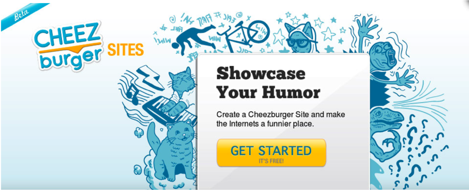
 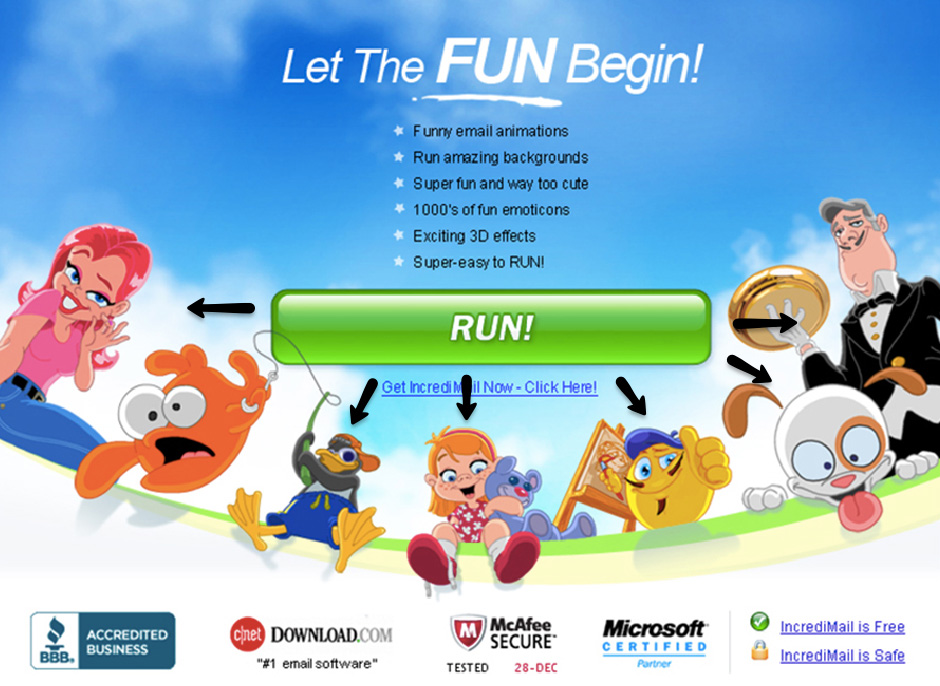 Another great example by Cheezburger.
Whitespace
Framing the CTA button with whitespace is a great way to detach the button from other elements on the page. Whitespace gives call to action buttons a more dominant presence. Basically by allowing enough whitespace (nothingness) around your buttons you’re giving it a more dominant place on your page. Remember: You don’t want the space to be too big as it can create an illusion of disconnection from the page entirely.
Positioning
The oldest rule in the book: place your CTA above the fold. The ‘above the fold’ area is the part of the landing page visitors see without needing to scroll. This area is where you place all your important elements – the CTA for example. The majority of visitors do not scroll and since you only have a limited amount of time to convert visitors into customers you have to position the CTA where it can be seen immediately.
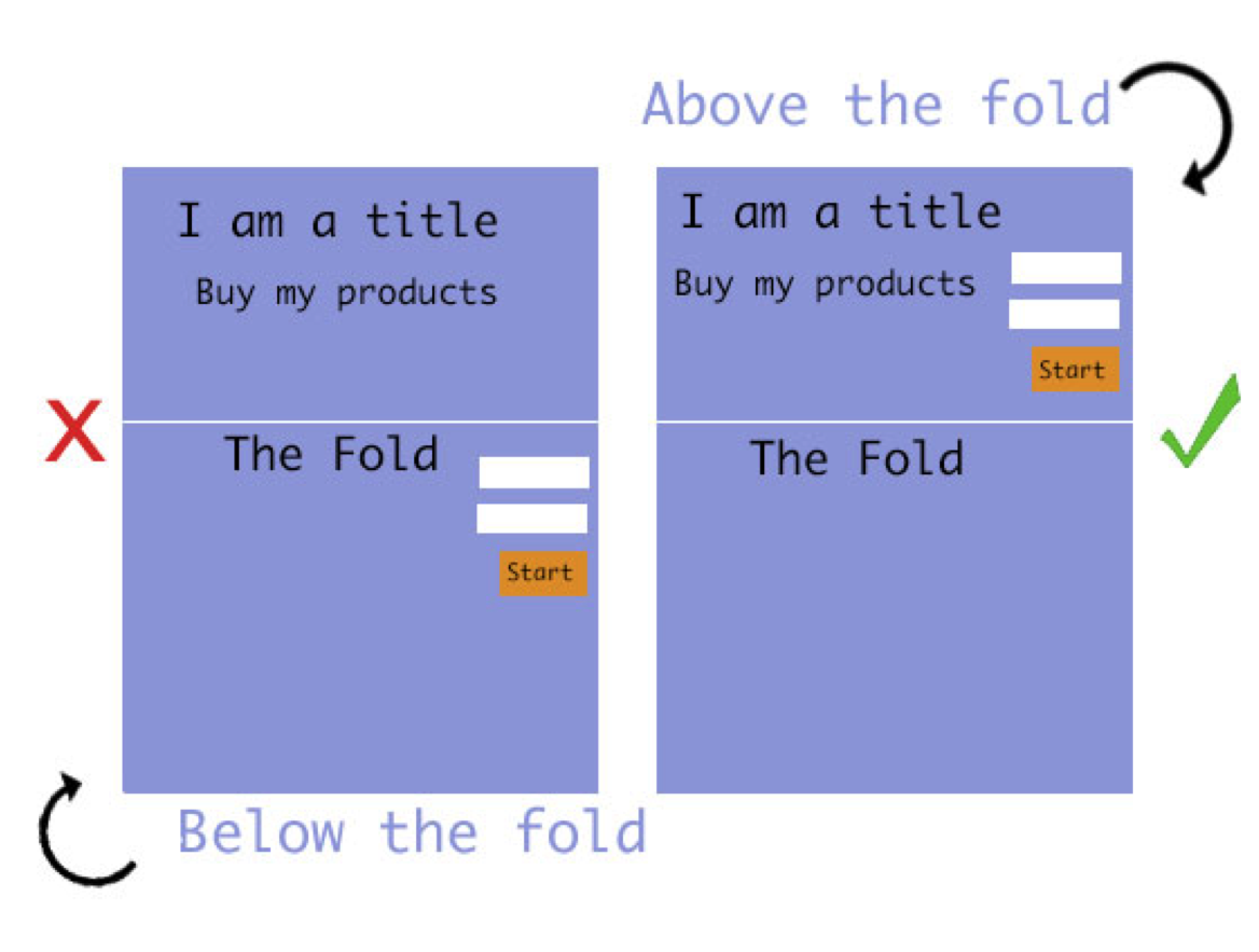
Microsoft places their call to action buttons at the bottom of their page, making visitors scroll all the way down to convert (if they did actually go looking for the CTA). Not the best idea. 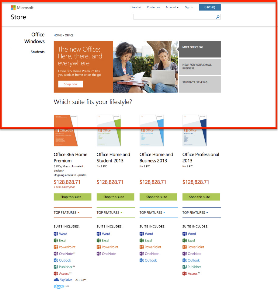
Messaging
When designing your call to action the text and messaging has a huge impact on its conversion rate. Having a call to action button that just says “submit” or continue” isn’t enough to drive conevrsions and add value to your visitors. There are 3 rules to follow regarding your button messaging and text:
- Clear and easy to understand
Convey a sense of urgency and value in your call to action buttons. Make sure the text stands out, offers true value to the visitor and tells them what to do. ‘Roon’ has a great call to action button in both contrasted color (giving it the full attention it requires) and action oriented text. The button provides exactly what a visitor is looking for: to begin writing a post. Another bonus is the supportive text they’ve added below the CTA, giving the conversion requested extra value. 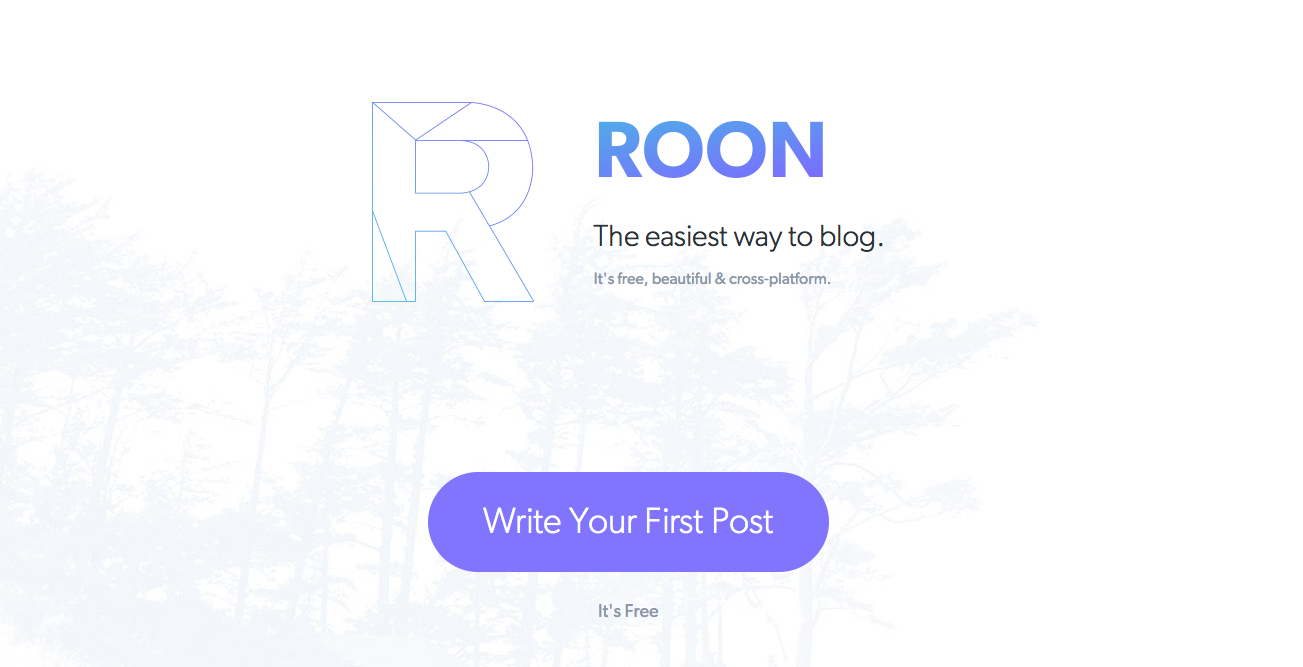
CTA Best Practices
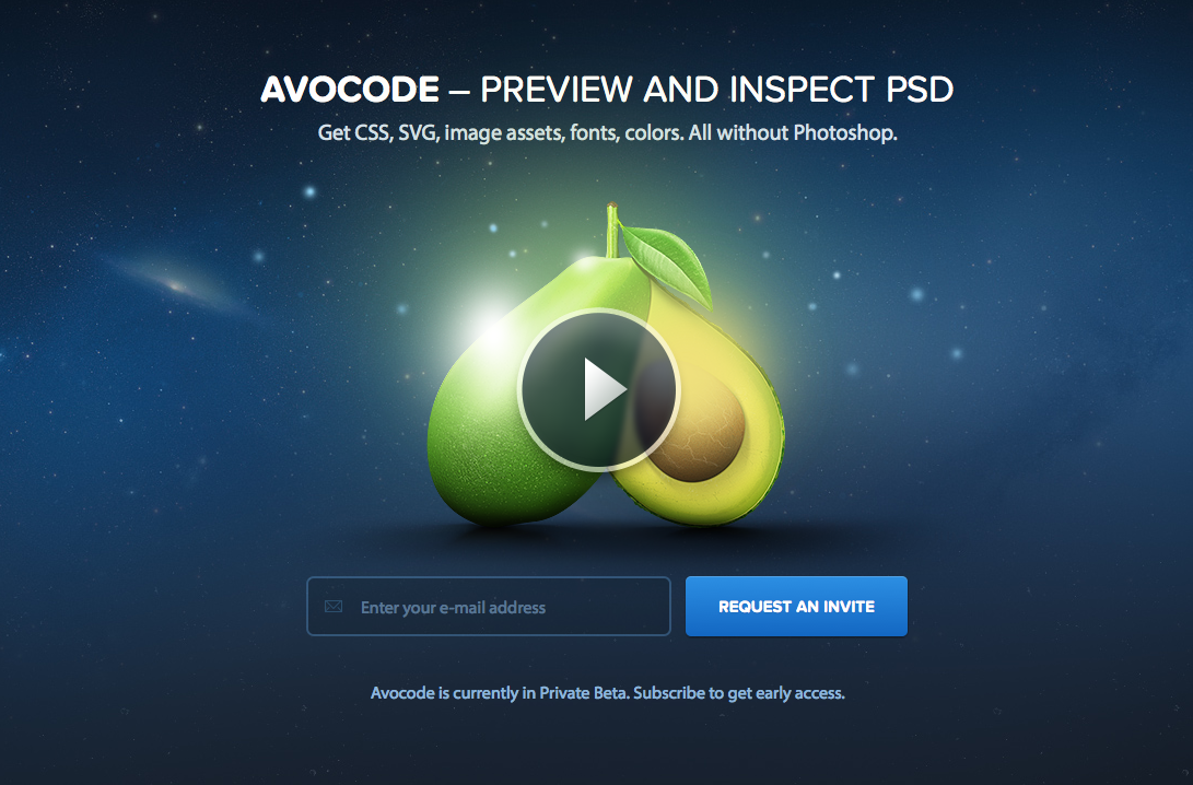
Before we move on to the third and last element of the CTA (strategy), check out these different types of call to action buttons we can learn a lot from: Avocode’s call to action button collects emails and leads for their beta launch in a great way. A few good points to look out for:
- There’s only one field to fill in
- The high contrast of the button color against the background
- Great amount of whitespace around the CTA.
- The use of the color blue projects calmness and trust
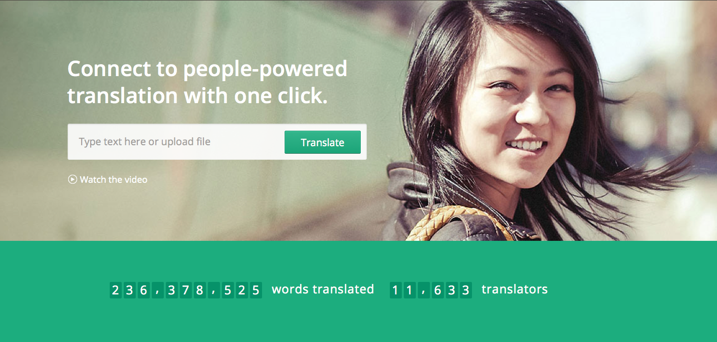
 Gengo’s call to action is a great example for:
- Highly action oriented allowing visitors to start the funnel in seconds.
- The button is large enough to call attention to itself
- Its color is the same color as the footer which projects trust and empowerment.
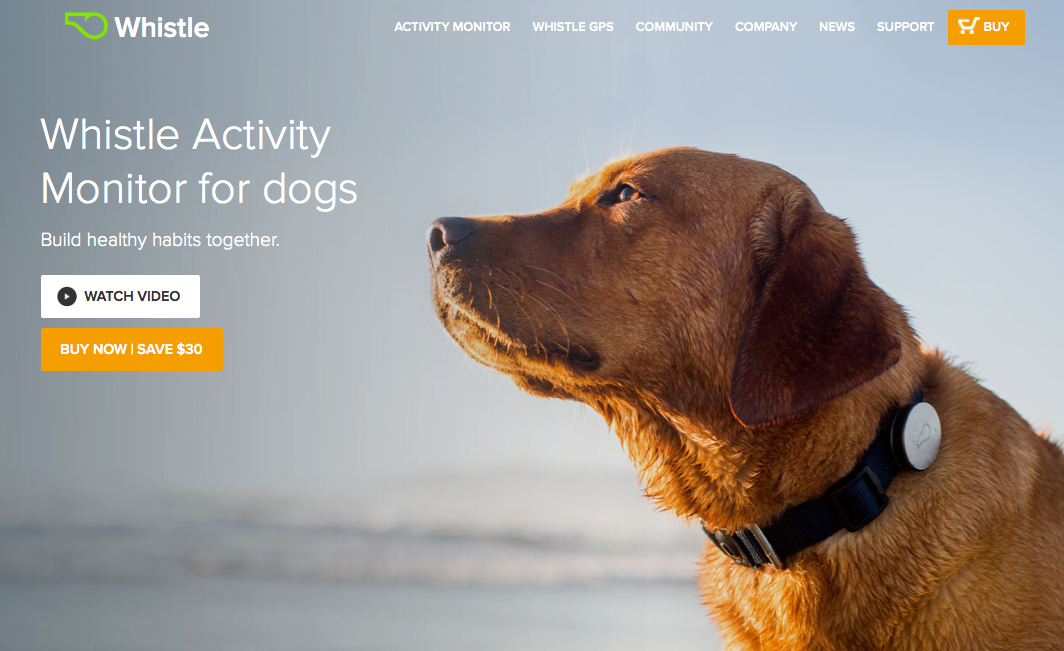
 Another cool example by Whistle -
- The dog pointing towards the CTA
- The call to action button in full contrast to the landing page
- One thing I’d change: The video button takes a lot of attention from the main CTA, one way to solve this is to move below the actual call to action button and not have it as a button, but more as a link.
Strategy
The call to action button is not enough. The CTA button is part of a larger element – the landing page. The call to action button needs to compliment the landing page by adding value to your visitors and more importantly making the next step obvious. The entire landing page should convey a certain strategy and emotional trigger. Having a good call to action on a landing page with no strategy is not enough. Remember you only have 2.8 seconds to convert visitors into your funnel, after that 40% will be gone. Make sure your landing page and call to action offer actual value to your visitors, and help them navigate through your site with ease. Call to action buttons are the gateway to your funnel. Build and design them in a way that opens that door and invites people to convert.
CTA buttons: Best practices and tips for higher conversion 4.67/5 (93.33%) 9 votes
Related Posts


CTA buttons: Best practices and tips for higher conversion
The call to action button is one of the most important elements of your conversion optimization funnel. Designing high converting call to action buttons requires planning; In this post we’ll cover important information about CTA buttons, check out different landing pages and their call to action buttons & learn how to optimize them for better conversion on websites, emails and blogs.
The CTA Button
These 3 key elements have a large impact on a CTA’s conversion rate and can make a world of difference by simply optimizing them:
Attention
Creating effective call to action buttons leads to higher conversions, the first part you want to address will be the attention the call to action buttons grab. A call to action button has to stand out and be the first natural place a visitor turns to. By making sure your call to action button is attention grabbing you’re making sure more people click on it. That being said, you do not want to exaggerate or overwhelm your visitors with a huge button, there are additional ways other than size that can grab your visitors attention:
Size
Size does matter. Compared to other elements on the page you want to make sure your CTA button stands out. The size of an element on your landing page will indicate it’s importance so make sure it is larger than any other buttons or links. This tip applies not only for landing pages but checkout processes too, the call to action has to be more dominant than other links or buttons and if possible, all others should be removed.
Color
The color of a button has a huge effect on its conversion. Other than the psychological effect colors have on purchasing habits, colors are a great way to make your call to action button stand out and be more prominent. Use highly contrasting colors for your CTA relevant to the elements on your landing page. Place your call to action on a background that helps bring out the CTA and doesn’t swallow it. Charity:Water has a great landing page that uses both a highly contrasted button color – blue on a green background and uses the image of the girl to direct attention to it. The use of this specific image is very interesting, it would be interesting to test different emotional triggers on this type of landing page.
Image
The image of your landing page takes the biggest part in your CTA’s attention. Other than making sure that your image isn’t grabbing all the attention from your button, the image can be a huge help and indicator for your users. Our brains process images 60,000 times quicker than text, meaning the image you have on your page will have a crucial roll in pointing people in he right direction. Make sure all your elements and images are complementing the call to action button and in some case even pointing at it. This landing page has 3 important elements emphasising its CTA:
Whitespace
Framing the CTA button with whitespace is a great way to detach the button from other elements on the page. Whitespace gives call to action buttons a more dominant presence. Basically by allowing enough whitespace (nothingness) around your buttons you’re giving it a more dominant place on your page. Remember: You don’t want the space to be too big as it can create an illusion of disconnection from the page entirely.
Positioning
The oldest rule in the book: place your CTA above the fold. The ‘above the fold’ area is the part of the landing page visitors see without needing to scroll. This area is where you place all your important elements – the CTA for example. The majority of visitors do not scroll and since you only have a limited amount of time to convert visitors into customers you have to position the CTA where it can be seen immediately.
Microsoft places their call to action buttons at the bottom of their page, making visitors scroll all the way down to convert (if they did actually go looking for the CTA). Not the best idea.
Messaging
When designing your call to action the text and messaging has a huge impact on its conversion rate. Having a call to action button that just says “submit” or continue” isn’t enough to drive conevrsions and add value to your visitors. There are 3 rules to follow regarding your button messaging and text:
Convey a sense of urgency and value in your call to action buttons. Make sure the text stands out, offers true value to the visitor and tells them what to do. ‘Roon’ has a great call to action button in both contrasted color (giving it the full attention it requires) and action oriented text. The button provides exactly what a visitor is looking for: to begin writing a post. Another bonus is the supportive text they’ve added below the CTA, giving the conversion requested extra value.
CTA Best Practices
Before we move on to the third and last element of the CTA (strategy), check out these different types of call to action buttons we can learn a lot from: Avocode’s call to action button collects emails and leads for their beta launch in a great way. A few good points to look out for:
Strategy
The call to action button is not enough. The CTA button is part of a larger element – the landing page. The call to action button needs to compliment the landing page by adding value to your visitors and more importantly making the next step obvious. The entire landing page should convey a certain strategy and emotional trigger. Having a good call to action on a landing page with no strategy is not enough. Remember you only have 2.8 seconds to convert visitors into your funnel, after that 40% will be gone. Make sure your landing page and call to action offer actual value to your visitors, and help them navigate through your site with ease. Call to action buttons are the gateway to your funnel. Build and design them in a way that opens that door and invites people to convert.
Related Posts
Tags: